Blame it on catalogs like SkyMall or the novelty shops of the ‘90s, but there was a time when many homeowners thought to add some character to their living rooms by adding a unique side table.

These side tables usually came in the form of a frog, dog, or some other animal dressed as a butler holding a tray. The trend was so common that even an episode of “Modern Family” featured a prized dog butler. Thankfully, in recent years we’ve let animals go back to being animals and side tables are now sleek and discreet.
Stop Covering Couches With Blankets and Fabric
A trend that seemed to dominate the last decade is the 'blanket-over-the-couch' fad. And no, we're not talking about throwing your winter blanket in the corner of the couch when you're done using it, we mean covering your entire couch with a piece of fabric or a blanket to make it look homier. Well, it doesn't. In fact, it doesn't look welcoming at all.
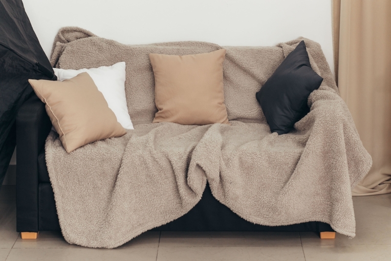
As inviting and cozy as you might think this looks, it actually seems like you are trying to cover up the couch in an effort to protect it from pet hair or dust, or even worse, cover a nasty stain.
Plastic Tablecloths Are Unsanitary
The printed plastic tablecloths that were a huge hit in the 1980s are definitely a thing of the past. Not only do they look cheap, but they're also quite unsanitary. Even if you need something for easy cleanup for a backyard barbecue, you're better off using a linen fabric.
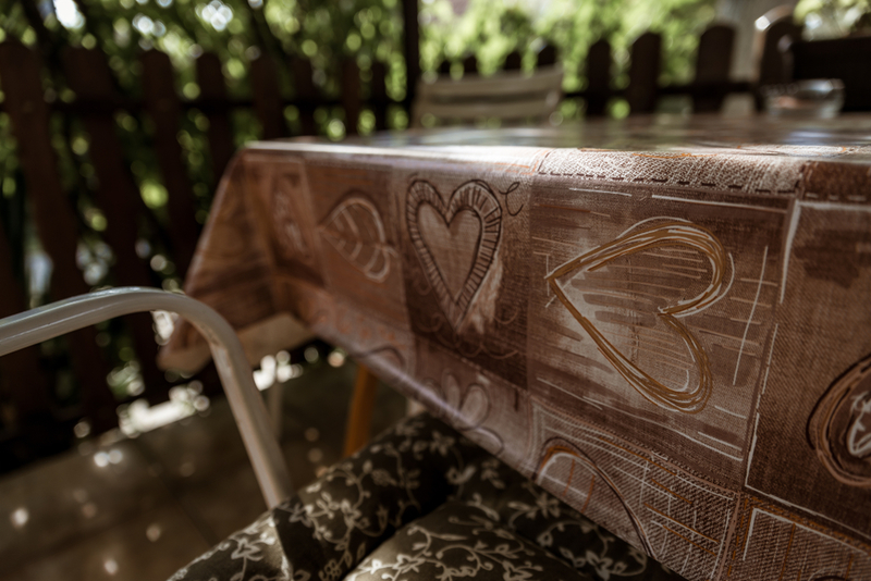
Linen looks better, feels nicer, and is certainly much classier than having a piece of plastic over your table. Plus, it's just far better for the environment. You can reuse linen cloth for years, all you have to do is throw it in the washer after a meal.
Beaded Lamps Are Archaic
Having their origins in the 1970s, it makes sense that beaded lamps are quite outdated today. Yes, we get it, they may look classic and beautiful, but they're just not practical for a modern-day house. They're simply too adorned and make a space feel cluttered and a bit chaotic.
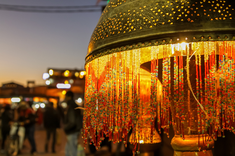
Besides, we seriously doubt you want to hear the beads jingle every time you stretch your hand to turn off your bedside lamp.
Round Beds Just Don't Make Sense
Think about it. If human beings are vertically aligned, why in the world would they want to sleep in a round bed?! It seems nobody thought of this back in 1968 when round beds made their debut in the home design scene. Thankfully, they only lasted a few decades.
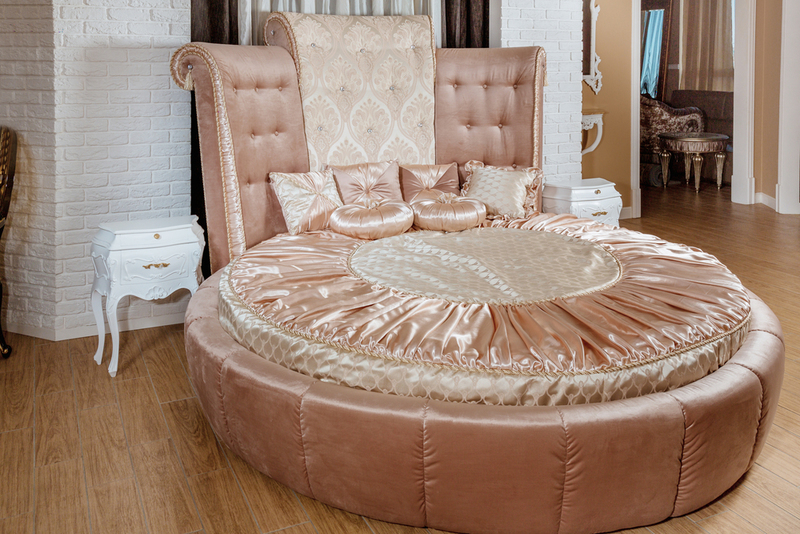
If you want to use a round bed as a groovy-looking furniture piece in the living room, go for it. But when it comes to your bedroom and sleeping comfortably, stick to your run-of-the-mill, king-sized, rectangular bed.
The Shiny Gold Fittings That Ruined Bathrooms
The early '90s were all about shiny things - flashy brass faucets, hardware, and light fixtures adorned nearly every bathroom. But unless you're a king or actually live in a palace, having a bathroom covered in shiny gold fittings looks very tacky.
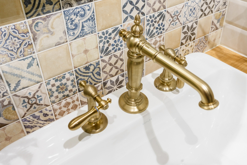
So do yourself a favor, realize you're not royalty, and opt for a cleaner, more modern look.
The Outrageous Novelty Phones
Before smartphones took over the market, there were novelty phones. We must admit that these are the epitome of '80s nostalgia, since they take us back to classic teen sitcoms of the time, like 'Full House'.

Novelty phones were basically a household staple back in the crazy eighties, and there was a wide selection of themes to choose from. Everything from lips to cartoon characters, to food items made talking on the phone a delightful experience. But as home decor? We couldn't think of anything tackier.
Brass Fixtures
Brass was in every home back in the 1980s, especially when it came to fixtures. Bathroom and kitchen cabinets, bedroom drawers, closets, everything was adorned by brass fixtures. The entire house looked like it had been covered in a goldish metal layer. Doesn't sound so classy, does it?
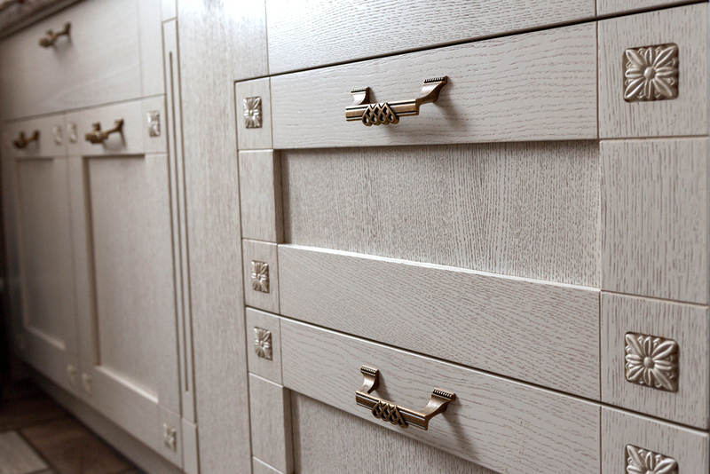
The problem was that brass made a house look old, and it was rarely actual brass, which meant it quickly faded and chipped. So, unless you're a millionaire who can afford actual brass fixtures, just stay away from this one.
Tropical Prints
An apology to all lovers of 1980's decor trends, but it's just impossible to not laugh at some of these hilarious decoration ideas. One of them being the famous tropical print craze, which was made even worse by its presence in 'Golden Girls' Blanche Devereaux's bedroom.

We love nature, but this is just painful to look at. There were tropical leaves everywhere - on the curtains, the bedsheets, the walls, the pillows, and even on people's clothing!
The Cheap-looking Lacquer Cabinets
If you remember '80s movies, you surely remember there was never a house without glossy lacquer cabinets. In fact, the shinier the cabinets looked, the better. But as we've learned with other '80s home decor trends, it's probably best to just stay away. Far, far away.
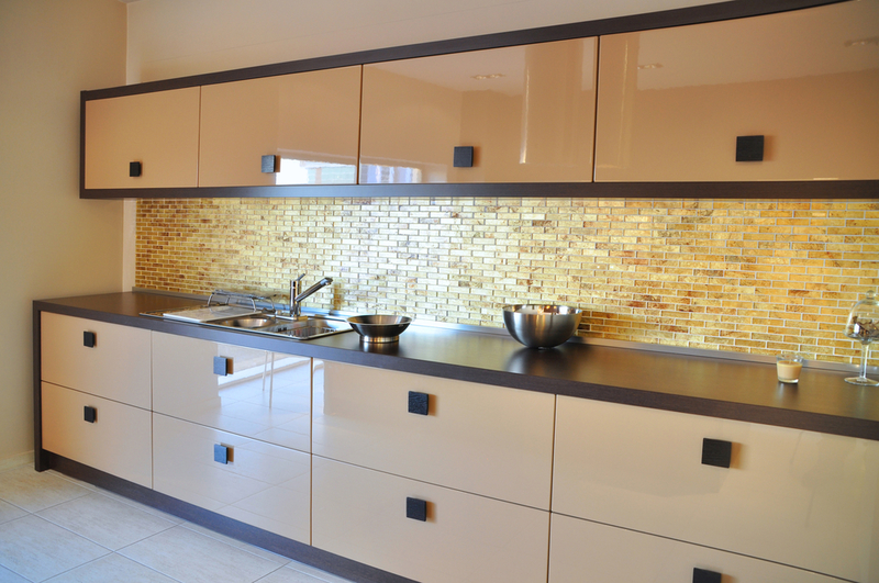
Adopt a more modern look for your house and stick to marble or granite countertops and stainless steel appliances. Leave the lacquer in the eighties, where it belongs.
Grandma's Lace Curtains
Lace curtains were a match made in heaven for the '80s frills and floral patterns. But they were definitely not practical, since having holes in your curtains kind of defeats their whole purpose.
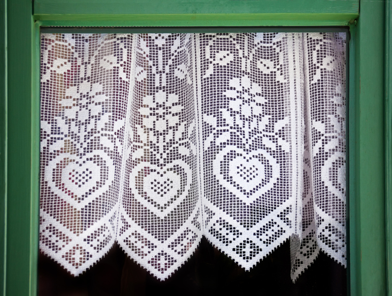
Yes, they're delicate, elegant, and lovely, which is why you can hang them as a decoration, not have them in place of actual curtains. Stick to dresses and lingerie when it comes to lace, not home decor.
Teal Carpeting
Remember the wonderful 1989 'National Lampoon's Christmas Vacation'? Apart from the fabulous Griswolds, you probably remember their '80s teal carpeting. And if you don't, stream the film and look at it, because it's the only time you should ever look at teal carpeting in your life.
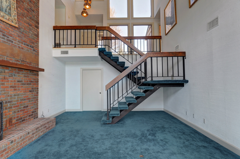
This 1980s home decor trend was a staple in every household; not only the wall-to-wall carpeting but the hospital-like teal color as well. As a rule, covering any room in your house with wall-to-wall carpeting should be prohibited by law, but making it teal? That should be a federal offense.
Metal Wall Sculptures Are the Epitome of Tacky
The 1980s were an interesting time for home decor, and while there were many good trends, three-dimensional metal wall decorations definitely weren't one of them. It was all about highlighting your walls back then, and people decided regular, 2D art wasn't enough anymore. They wanted sculptures; hideous, gold-colored, metal sculptures.
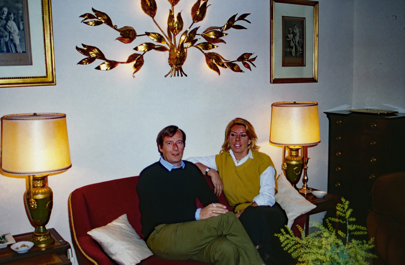
We really can't explain how completely tacky this looks, and while we completely respect peoples' tastes, having your walls covered in ornate metal sculptures of flower bouquets and flying birds is simply atrocious. It's a fact of life, whether you want to accept it or not.
The Giant and Overly Extravagant Drapes
The first thing that might come to mind when seeing these gigantic, super extravagant drapes is a room in a French palace. But unfortunately, these over-the-top curtains invaded American homes in the 1980s, and honestly, it's a miracle they never killed anybody, considering how heavy they were.
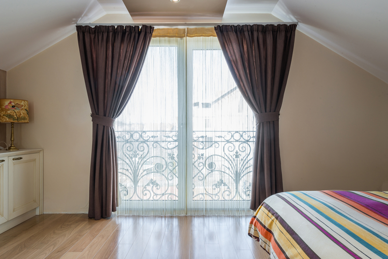
There's absolutely no need to have such giant drapes in your home. A simple, classy curtain will do the job just fine.
Mauve Is Murder
Remember the avocado-green phase in American home decor of the '70s? Well, the '80s were all about mauve. The pale purple color invaded homes across the country, covering walls, ceilings, rugs, couches, lamps, all of it! And frankly, we feel there really is no need to tell you why you should avoid covering your home in pale purple.
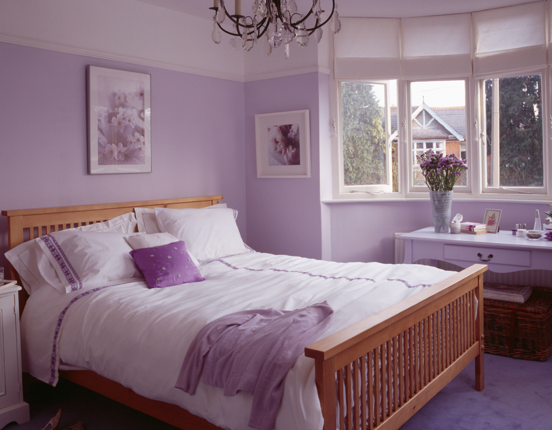
The reason this became a trend in the first place can probably be linked to Georgia O'Keeffe's death in 1986. After she passed away, a lot of her work became very popular, and as you probably know, mauve is a predominant color in her sunset and desert earth-themed paintings. And that's where mauve should've stayed - in a painting.
The Infamy of Heart-Shaped Hot Tubs
Another '80s home trend that was wildly popular was the infamous heart-shaped hot tubs. This genius design idea was actually invented back in 1968, by a resort owner in Pennsylvania. People went crazy over it, and it quickly became a fixture in homes and hotels around the country.
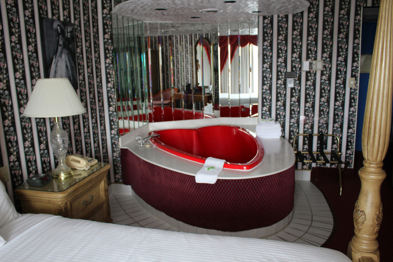
Nowadays, unless you're on a romantic getaway or in a honeymoon suite, you'll have a hard time finding one of these. And we couldn't be happier.
The Clear Furniture Craze
Back in the '80s, clear furniture was all the rage. You'd see it in Hollywood blockbusters, at your friend's house, in the furniture stores, and thankfully, four decades later, you'll only see it on the street.

Unless you're a mobster in Miami in the 1980s, or an Art Deco magazine cover photographer, you have no excuse for owning clear furniture.
Stop With the Ivy Wall Designs
The popular ivy wall design had its peak at some point during the '90s and 2000s, and while we appreciate the effort of someone not wanting to have a plain, white wall in their kitchen (or anywhere in their house), that doesn't justify making your house look like a tacky fairytale forest.
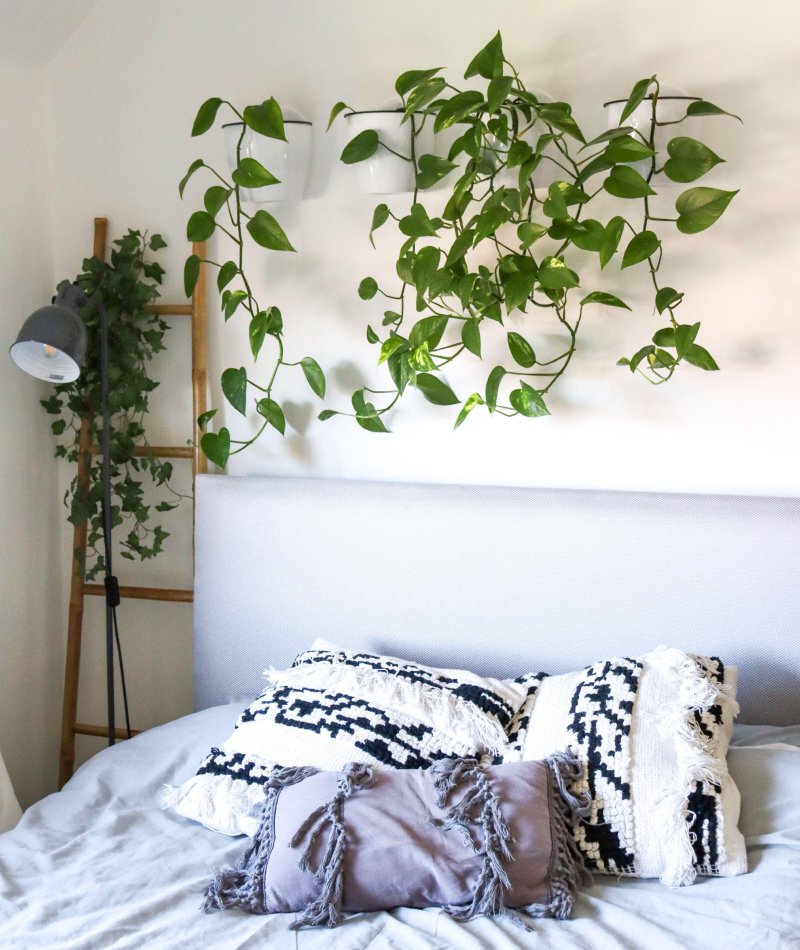
A few ivy vines on one of the wall's borders? Yes. Covering your entire house in decorating flourish? Absolutely not.
The Plastic Couch Cover
There is nothing more 'retro' than the plastic couch cover trend from the '60s and '70s. Originally, the 'clear plastic cover over the couch' trend had a very simple and functional reason: you could protect your furniture while still being able to look at it. However, many people just adopted this as a home decor trend, and it's definitely overstayed its welcome.
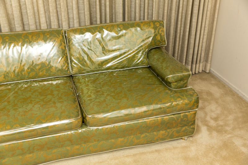
The cover does lengthen and maximize the life of your furniture, but it also looks like you're living in a furniture store where everything is on display and in its original wrapping. Talk about the opposite of homey.
The Completely Unnecessary Pelmet
The pelmet originated back in the 15th century, during the Renaissance. They added a certain elegance and flare to the very lavish rooms of monarchs. However, in plain English, the pelmet is simply a framework placed above a window in order to conceal curtain fixtures. And it is completely unnecessary and looks absolutely tacky in any modern house.
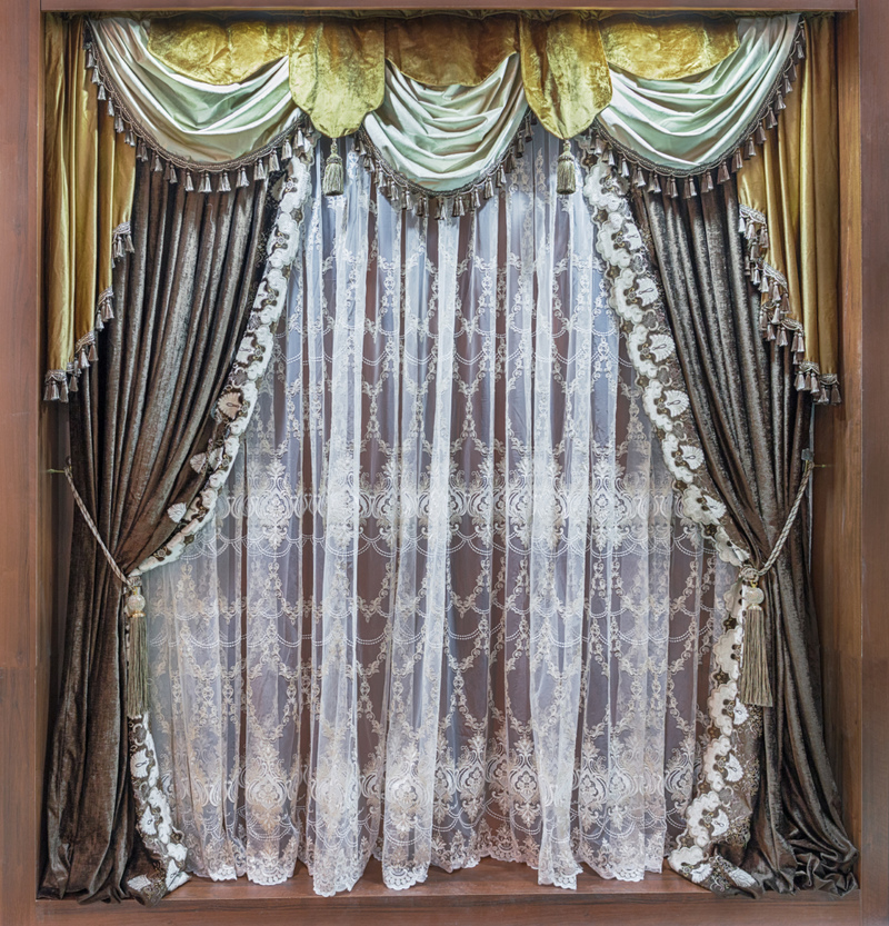
It's curtain overkill and just unnecessary extra work. Just chose some nice curtains and be done with it. It's not like you're Queen Elizabeth II.
The Disastrous Waterbeds
The infamous waterbed was all the rage back in the late 1980s, but this innovative, and terrible, idea first originated back in the 1800s, when Scottish physician Dr. Neil Arnot invented a "hydrostatic bed for invalids", with the intention to help with bed sores.

But through the years, the waterbed evolved to become a groovy house trend associated with excitement, and even debauchery. And if you've ever had the displeasure to sit or sleep in one, you know these beds should've stayed back in the 1800s.
Beaded Curtains Are Only for Palm Readers and Psychics
The famous beaded curtains trend originated back in the '60s, in Asia. The noisy bead strings, which were supposed to have a soothing effect every time you passed through them, were used as room partitions back in the day. But once the trend hit the U.S., people just went crazy. They were everywhere, and it was too much.
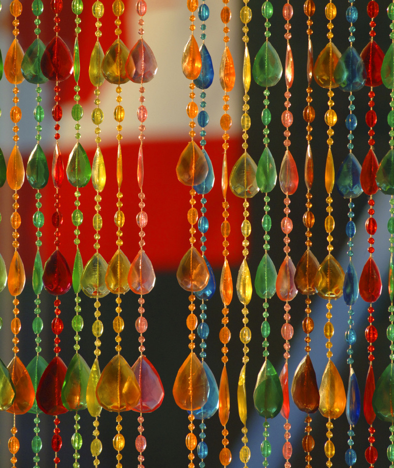
Having one set somewhere around the house for decoration purposes is fine, but you do not want to have beaded curtains as an actual replacement for a door. Why? Because your house won't look "'90s cool", it'll look like a convention of palm readers lives there. Besides, people tend to forget how annoying it was to have to untangle them every time you passed through.
Who Actually Thought of Carpeted Bathrooms?
Even though back in the '90s, carpeted bathrooms were all the craze and the ultimate sign of luxury, there are fewer things more disgusting and impractical than covering your bathroom with carpeting.
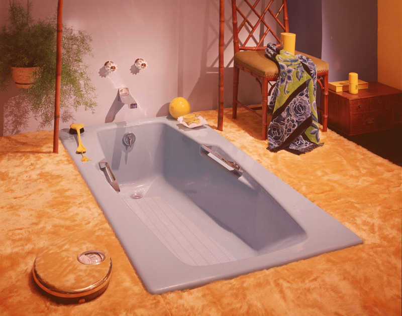
Yes, they looked fantastic when you saw them in a movie, and maybe it seemed comfy to get out of the bathtub and step onto a fluffy carpet. But folks, mildew and bacteria are no joke. And they will come for you if you have a carpeted bathroom.
Hell Is Full of Potpourri
If you want to keep a small basket of potpourri in your bathroom, go for it. But that's it, that's all the potpourri you should ever have lying around the house. Yes, potpourri baskets were beautiful to look at and smelled great, but they also gathered huge amounts of fluff, dust, dirt, and pet hair like you couldn't even imagine.
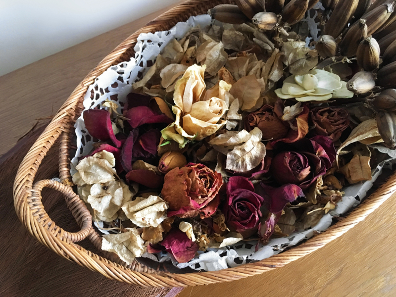
So, unless you're planning to have a closed basket of potpourri with a few holes on the top so you can enjoy the scent, just avoid this decor trend altogether.
It's Over for Glow-in-the-Dark Stars
We all loved glow-in-the-dark stars when they first came out decades ago. As a kid, and even a teenager, covering your bedroom ceiling in them made you feel like you were sleeping in space. But folks, it's time to get over it. And especially, it's time to realize how much damage these little stars actually did to a perfectly good paint job.
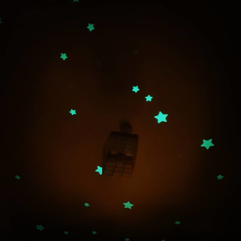
If you want to be a cool parent and indulge your kid with these glowing stickers, keep it in their bedroom. And preferably, to a very small section of it, if you don't want to spend days covering up the paint afterward.
The Tacky Inflatable Furniture
The '90s brought a lot of good trends, but inflatable furniture wasn't one of them. In fact, inflatable chairs had been around since the '60s, but it was in 1990 that they made a huge comeback. As groovy as it looked, and as much as children loved the glittered version, having inflatable furniture in your home is not only tacky but completely unreliable.
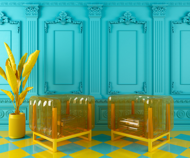
Unless you're in an Austin Powers movie set, leave the inflatable furniture for the backyard or the pool. Do not, we repeat, do not bring them into your home. Besides, if you're ever carrying around a pin in your pocket and happen to forget before you sit down on the blow-up chair, we don't need to tell you the chaos that will ensue.
The Famous Chevron Patterns
This is another home decor trend that has been around for way too long. The famous chevron pattern has been dominating spaces for decades, covering rugs, accent walls, blankets, pillowcases, and basically anything you can think of when you walk into a room. But enough is enough.
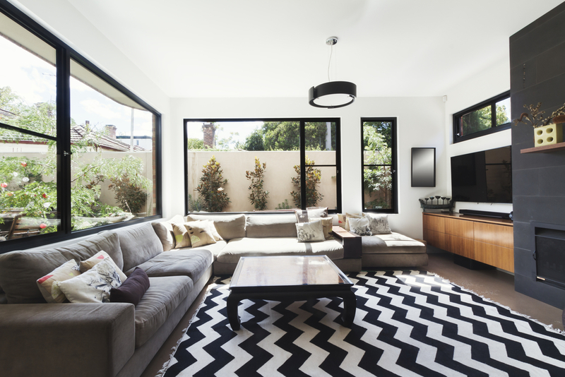
There's nothing wrong with using the fashionable chevron pattern on certain pieces in your space, but do not overdo it. Unless you want your house to look like a nausea-inducing optical illusion. Use chevron patterns to your advantage and give your space a modern feel by only using it on one or two pillows, a small rug, or some wall art.
Open Shelving Overkill
This is another home decor trend that must be done in absolute moderation unless you want your house to look like a cluttered, chaotic little shop of oddities. Open shelving can look beautiful if done right, but make sure to not overdo it.
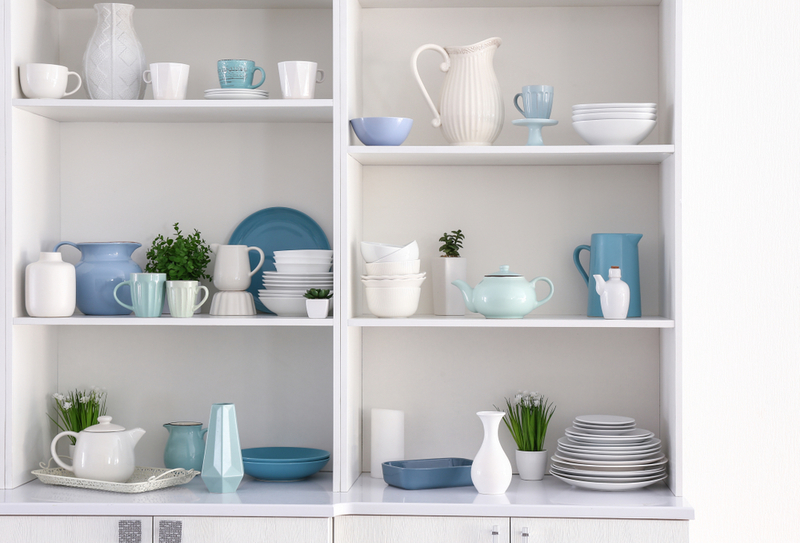
Add one or two shelves in strategic positions that aren't already cluttered with another object, and use them to display items that are easily organized (e.g. plates, bowls, cups, etc.). And ideally, open shelving works best in areas like the kitchen, or a study.
Too Much Reclaimed Wood
As beautiful and rustic as the reclaimed wood looks, you have to know when enough is enough. The idea of using reclaimed wood over a specific door, or section of a wall, can be great - it can give a room a classical, antique look. But remember, stick to a single piece, don't get any ideas about covering an entire room in it.

When it comes to reclaimed wood, less is always more.
Pointless Valances
Matching window valances are an especially horrid decor choice, but window valances in general really aren’t that great. They add a little trim at the top of your window, but for what? There’s no real purpose of this really.

However, something about these hanging bits of fabric ages your space immensely. Even with the most modern design, window valances will automatically make you look like you’re living in a different decade. Since they don’t have a real purpose anyway, it should be easy to throw them out of your design plan.
Another Fixture of the College Dorm
Not a college student? No need for a bean bag chair. The ‘90s really vaulted this comfy piece of furniture into the mainstream, convincing you that it was totally fine to use it as your seating of choice.
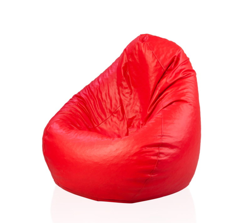
That, unfortunately, is untrue. While the bean bag is comfortable, it looks messy and lazy in a real home. Real couches are still very comfy. Maybe you should try one out.
A Bright Green and Gold Color Palette
Who was the genius who thought that green carpeting throughout a house was a good idea? Unfortunately, this trend of avocado-green combined with gold accents was quite popular throughout the ‘70s.
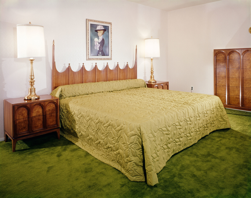
Do we really have to explain why this is bad? Each color is far too intense in its own right to make for an aesthetically-pleasing design. Plus, too much green anywhere starts to bring a sickly feel to your home. If you want a contemporary design, stay far away from this color combination.
Don't Get Wordy
Plastering “live, laugh, love” on your walls doesn’t make for a homey, comfortable space. Home decor stores, particularly the cheap ones, are full of wordy signs and pictures, often with the most simple of phrases. “Home,” “Gather,” “Family”— what’s the point of all these signs?
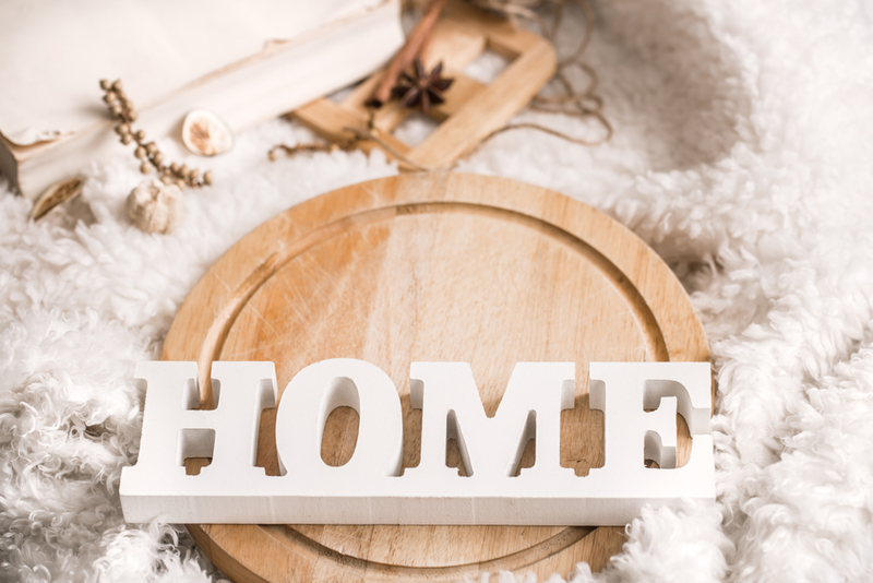
Often, word art is used simply as a way to fill a space. But just because you can fill a space doesn’t mean you should. Hold out for a design piece that really adds something to your home, rather than some generic word that can make your pad look a little cheap.
No More Puffy Headboards
Those puffy, or tufted headboards as they are correctly called, used to be the height of glam, but that was in a much older era. What once looked luxurious now tends to look a little stuffy. A statement headboard is a good idea, but a tufted piece will only continue to make your home look dated.
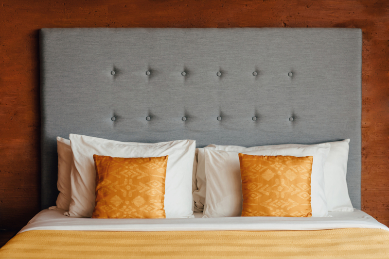
If you want something that stands out, choose a beautiful headboard that actually looks distinct from your bedding. Stay away from tufted headboards—they’re only going to get more and more unpopular.
Large and Bold Prints
The 1960s were all about being free and enjoying the world around you. Unfortunately, some of that indifferent attitude also entered home design. The ‘60s really saw the rise of bright, bold patterns scattered across a room. After all, it was a time to live, so why wouldn’t they make their houses as crazy as possible?
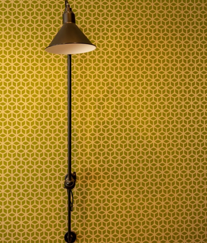
Unfortunately, those bright, floor-to-ceiling patterns aren’t a long-lasting decision. Not only are you bound to get dizzy after a few months of looking at that every day, but it also makes it difficult to create a comfortable, cohesive space.
Cool It With the Ferns
A bit of greenery in the house is simply beautiful, but do you really need a big, leafy fern in every room? Beyond the fact that other plants exist, ferns are a pretty dominating piece of decor. They’re easy to care for, but too many of them will make your space look like an image right out of Jumanji.
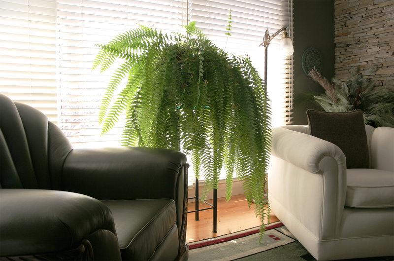
If you want some greenery, try to use a diverse spread of plants. That way, you’ll get that bit of the freshness you’ve been looking for, but you won’t turn your living room into an indoor rainforest.
You Sleep on What?
Are you a college student looking for more furniture for your dorm? No? Then you shouldn’t have a futon. If you’re over the age of 22, futons are no longer acceptable.

They’re made to be cheap pieces of furniture with a versatile function perfect for young people who don’t yet have a permanent space. But in an adult home, they just make you look like you don’t know what you’re doing. Traditional sofas are better suited to adult decor.
Less of the DIY Furniture
Just like fast fashion, fast furniture isn’t really made to last. It features an inexpensive design that’s easily assembled when you don’t have many other options. While the furniture is inexpensive and can look okay in your space, it’s not exactly the height of interior design.
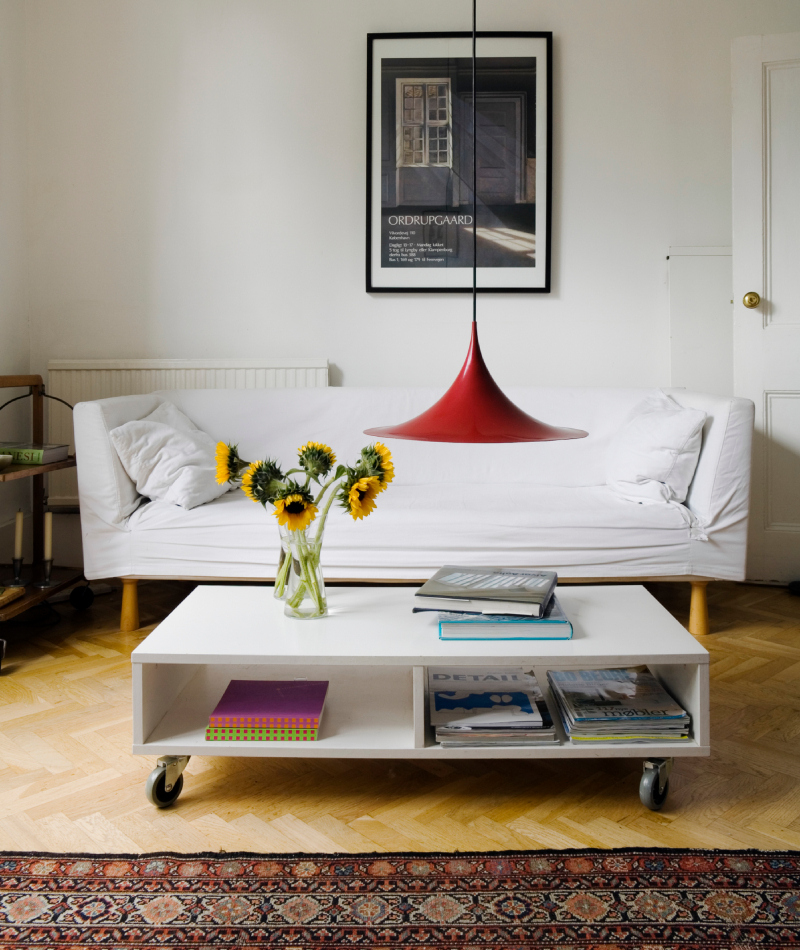
In addition, fast furniture isn’t very environmentally-friendly, and it doesn’t lead to a lasting design aesthetic. It’s better to invest in pieces you really love and build your collection slowly, rather than buying new pieces every year that will just get thrown out.
Chunky and Overly Adorned Headboards
While tufted headboards are no good, incredibly heavy headboards are equally as cringe-worthy. A large block of wood sitting at the head of your bed seems like a good idea...until you have to move it to a new location.

While these behemoths used to be the height of popularity, their imposing presence often overtakes a room. It’s better to opt for something a little more modest and implement your design talent in other aspects of your space
No Silk Sheets, Please!
Silk sounds like the most luxurious, comfortable fabric. If you want your bedrooms to scream opulence, silk seems like the obvious choice. And it was, at one time.
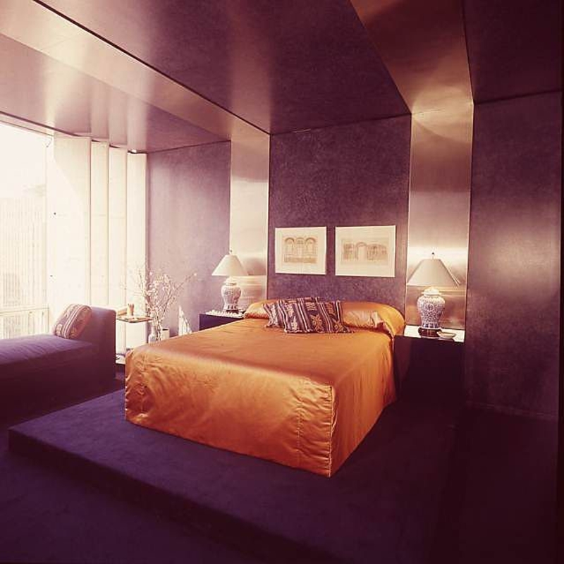
Now, however, silk ends up looking cheap and tacky. Silk sheets are perfectly okay, but your duvet should be made of a softer, comfier fabric that doesn’t look like it belongs in a music video.
These Wooden Counters Must Go
Alongside the bright, bold, far-too-colorful cabinets, the ‘70s touted the benefits of wooden countertops. While this trend can actually look impressive if paired with more neutral tones, wooden countertops aren’t an easy design trend to pull off.

When done incorrectly, wooden countertops result in a dark space that feels more like a dungeon than a kitchen. Modern materials are better suited to creating that light and bright look that’s so popular nowadays.
Decades Past Its Prime
Terrazzo is a lot like linoleum. It’s durable and fairly versatile, which is why many designers used it from 1930 all the way through 1970 as their flooring of choice.
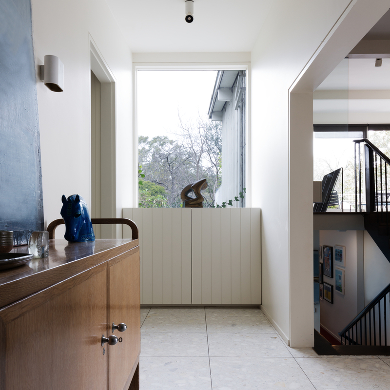
Today, however, terrazzo doesn’t really belong in the home. It looks a little cold and clean, making it much more suitable for your office building. Warmer materials are better for a house, which is why terrazzo should stay far away from your home decor plan.
Window Blocks
Glass blocks used to be the ultimate way to create a light and bright bathroom space, without sacrificing any privacy. Unfortunately, they haven’t withstood the test of time. With so many new materials at our fingertips, glass blocks now tend to look cheap and dated.
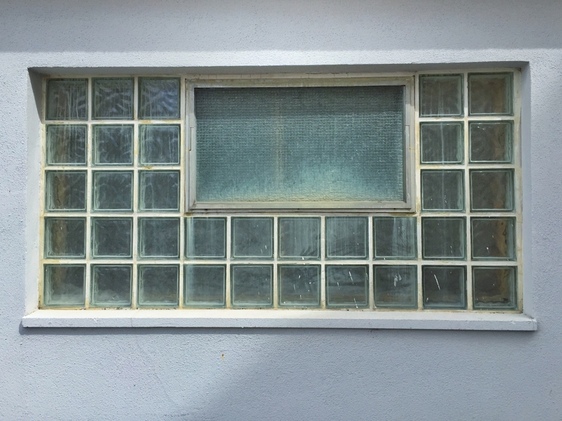
In addition, they’re not the easiest to maintain. The seal between the glass blocks tends to get dirty over time. The more yellow that seal gets, the older your house tends to look. Wave goodbye to the glass blocks and hope that they never come back.
The Carpet and Wallpaper Duo Disaster
The colors in your home should combine nicely with one another. However, that doesn’t mean that every color should be perfectly matched. The ‘70s didn’t quite understand that. This era, unfortunately, introduced us to a design trend of matching wallpaper and carpeting.
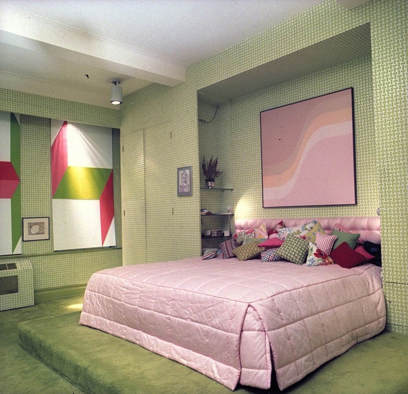
Somehow, this trend always occurred in the weirdest colors, like bright orange or dark green. The result was a monochromatic look that didn’t leave much space for other colors to intervene. Please leave this trend in the ‘70s where it belongs.
The Tired Accent Wall
An accent wall was used to bring out a single, specific wall in a house. And while this wasn't an entirely bad idea, it was certainly overdone. Besides, people slowly started to realize that the trend of having a single wall covered in snappy wallpaper or painted a different color just seemed tired.
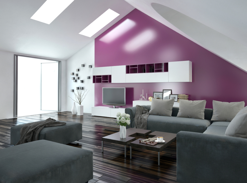
In fact, it almost started to look as if the person couldn't finish the job due to budget cuts or lack of interest. Just do yourself a favor and leave the accent walls in the past.
Let’s Leave the Outside Furniture… Outside
Using rattan (plant material from palms) to create wicker furniture is one of the oldest furniture-making techniques. And while we appreciate the craftsmanship required to create these pieces, they just don’t belong inside.

In the backyard? Fine. On your porch where you sit around sipping sweet tea? Even better. But please do not bring wicker furniture into your home. Let's not even talk about how difficult it is to clean, with dust accumulating in between the weaves. If you grew up in the South, you know exactly what we're talking about!
Closing the Chapter on Open Concept
Most interior designers initially welcomed the “open concept” layout for homes. So free, so open, so much flow is what they thought… and then real life set in.
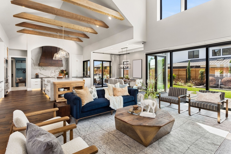
The truth is that we all need a bit of privacy now and then, and open concept homes make it hard to get a bit of alone time. This becomes even more obvious if you have children or work from home. Another very real issue with open concept layouts is that given the large area required to heat or cool, they’re not the most energy-efficient.
An End to the Industrial (Design) Age
There was a time when many thought it would be so cool to live in a converted factory or another type of industrial space, complete with exposed pipes, industrial lighting, and even old brick walls. While this design theme can occasionally look really good, it has been overdone.
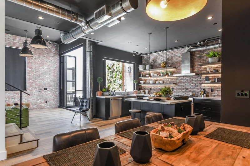
Architects and interior designers are no longer just converting existing industrial spaces, they’re choosing the style’s distinctive features in newly constructed buildings too. Industrial-style designed homes can also come off as being cold with metal pipes and concrete floors.
No More Home Offices
This entry may be controversial as there are people who will defend the need for having an in-home office. There was a time when many people had what many referred to as a “computer room” with a bulky desk and an even bulkier computer.
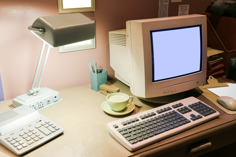
Today, however, most computers are smaller and lightweight, giving us flexibility when it comes to where we work. Want to draft that report by the pool? Send that email from the kitchen while you eat? No problem. There's no longer a need to use a room for one sole purpose.
Interiors for the Real World
Sorry Kim Kardashian and other social media influencers, your all-white stark interiors are just not functional for the real world. While we can admire this bold and pleasing (so clean!) design, it just doesn’t work in real life.
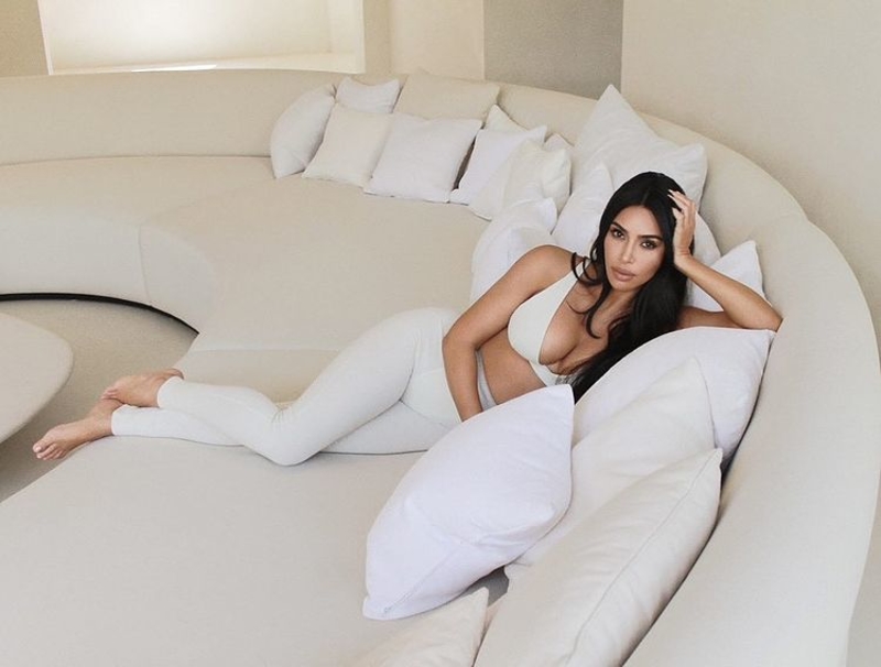
It would take most people just a few seconds to accidentally spill coffee on that white couch or white rug or leave a water ring on that all-white kitchen. On top of everything, all-white interiors can sometimes remind us of a sterile hospital — not exactly the type of place you want to come home to!
Curl Up and Dry
Humans have been bringing flowers and other plants into our homes since ancient times. While many flower-themed home trends come and go, one seems to have enjoyed a resurrection after many interior decorators thought it had ended — dried flowers.
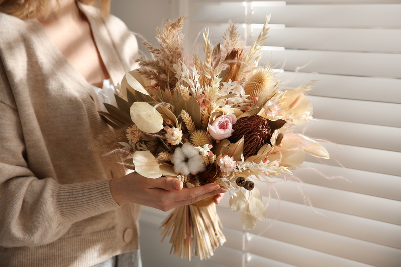
Between shedding little pieces to collecting dust, these ornamental flowers are often more work than they look. Plus — why do we want dead flowers in our homes? Let's let this floral trend die out finally. Instead, choose live plants such as succulents or certain species of vines to bring a bit of life into your home.
Even Tables Get Cold
We're not sure why, but at some point, we decided that furniture must have feelings too. Otherwise, what could explain our need to drape heavy tablecloths or frilly bed skirts on the pieces of furniture in our home?
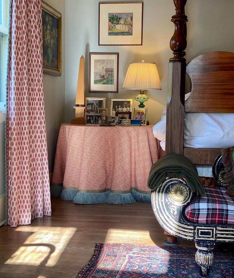
The worst offender was probably the side table with the table skirt typically topped with a protective piece of glass. These tables were so common that many of us grew up with at least one of these (bonus points if it also held a bunch of unnecessary knick-knacks). Say it with us now, tables do not need skirts!
We See You!
When it comes to interior decorating trends, there seems to be a big difference between form and function. While many things may seem like a good idea, they're not always the most practical.
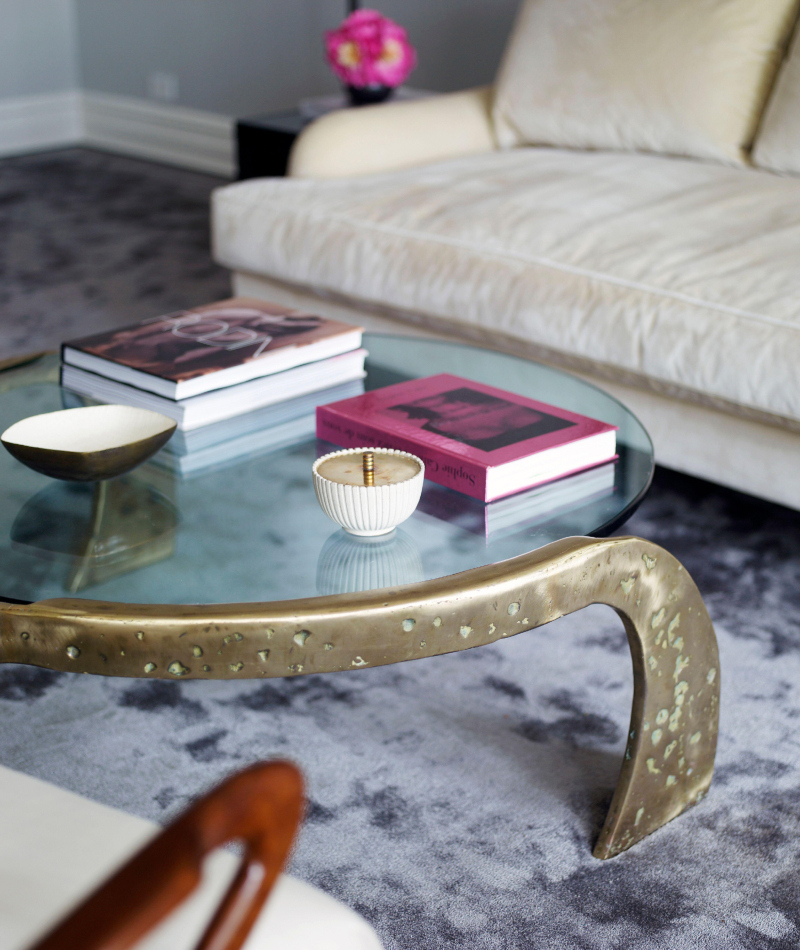
For example, the glass table. Heavy glass tables typically combined with bulky metal accents seemed to be the rage during the ‘80s, with these tables being the ultimate expensive home addition. Not only is it weird to see everything through the glass, but keeping these tables clean was a nightmare. Imagine how many gallons of glass cleaner must have been used during this time!
"Miami-Vice" Inspired Furniture
Blame it on shows like "Miami Vice," but suddenly, there was a time in the ‘80s and even early ‘90s when it seemed like everything was a similar combination of teal and soft pink. From furniture to wallpaper, these vaguely tropical colors reigned.

Put against white wicker furniture and some seashell accents, and we just described most of the homes and waiting rooms of that period! While there’s nothing inherently wrong with teal and pink, the combination tends to remind us too much of the apartments shown on "The Golden Girls."
Definitely not Di-Vine
During the late ‘80s and ‘90s, many of us can recall either visiting or living in a house with large plants growing from the top of the cabinets or other high places. Whether real or fake, these overgrown plants seemed to overtake and practically spill over the cabinets.

If they were real then the chances of them attracting bugs were high. If they were fake they probably were covered in dust. Either way, we can't understand the appeal of them, especially not putting them at the top of these inaccessible places!
Clearly, That Was a Mistake
Before we were lining up for the latest cell phone release, there was one phone everyone needed to have — the transparent house phone. With its clear exterior and busy intricate interior showing all of the wires and other components that make a phone work, nothing seemed cooler.

In fact, just seeing this phone reminds many of us of our childhood. But like the house phone itself, transparent phones soon fell out of fashion and now this once-admired phone belongs in the museum of bad product designs.
Ye Olde Tacky Home
Call it romanticism of the old West, or maybe it was Western-themed shows and movies that fueled the desire to suddenly decorate our homes with a Southwestern theme. Suddenly it seemed like every living room had at least one pastel-colored painting of a desert landscape, not to mention cacti or terracotta-colored items.
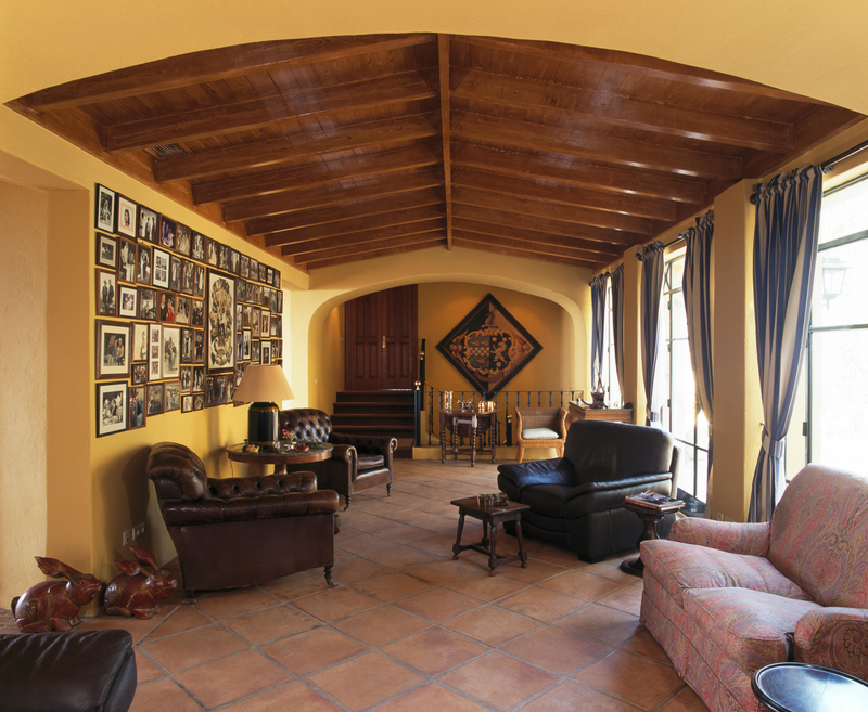
Homeowners decided to tile their homes in Spanish terracotta floor tiles that matched perfectly against desert-colored sponge-painted walls. Thankfully, as minimalism and more contemporary design came into fashion, these desert designs slowly disappeared.
Heavy and Itchy — What More Could You Want?
When visiting a used furniture or thrift store, there's a good chance you will come across a heavy couch covered in thick jacquard fabric. Coveted for its durable and resistant construction, this fabric was once considered the height of wealth and sophistication.
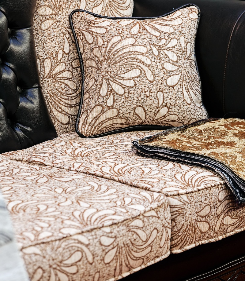
Perhaps that's why it covered so many couches in the “nice” living room (you know, the one no one was allowed to sit in except for company). In reality, the jacquard fabric is itchy and heavy, not to mention is a major dust magnet.
New Meaning for the Term “Man-Cave”
We're not sure if it was the desire to create our own version of the famous Playboy mansion’s grotto, but the ‘70s brought one of the strangest trends in home design — an obsession with putting stones everywhere.

From home facades to the walls of basements, suddenly we all took a trip back to the stone age with this trend. What we didn't realize back then was that this stony look often made our homes look like actual caves, and created a dark and inviting ambiance (although, maybe that was the point?).
Toilets Get Cold Too
In case most people don't have enough work trying to find the perfect accessories for their everyday outfits, there was a time when toilets also required accessorizing. Suddenly, shops stocked everything from little rugs to go around the base of the toilet to carpeted covers for the lid of your toilet.
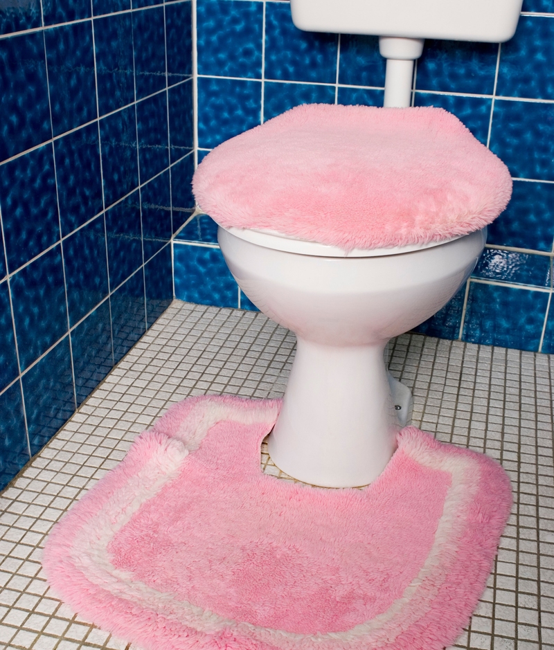
Why on earth did we feel the need to blanket our toilets in a shaggy carpet? Let’s not even get into how unhygienic it is to have an absorbent rug in an area prone to erm, let’s just say spillage. Yuck all around!
Float Away
While there are definite examples of cringe-inducing bathroom design trends (looking at you, carpeted bathrooms!), there are some that have a place on this list less because of how they look, and more because of how they function.
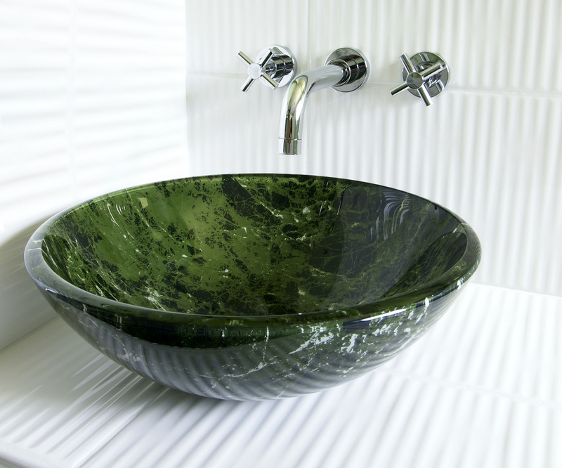
Vessel sinks look great and modern on the vanity of your bathroom. The problem? As soon as you turn the faucet on and begin washing your hands or face water tends to spill everywhere. This spilled water quickly leaves your bathroom looking like a splash zone and makes the perfect environment for mold to grow around the base of your sink.
Figure It Out
If you think about your grandparents’ home or the home of someone from another generation, you probably can recall a display or table with a collection of tiny collectibles. From ballerinas to clowns (why did people collect little clown statues?), we couldn’t collect enough of these small figurines.
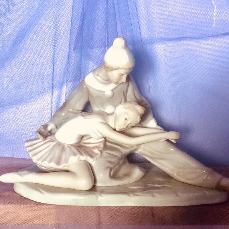
Suddenly shelves were covered in dust-attracting figurines and we finally got the answer to the age-old question — is there really such a thing as too much of a good thing? Looking at our cluttered collections, we have to say yes. These old-fashioned figurine collections instantly age your home.
Busy Busy Busy
We get it. A bare wall can look cold and sterile. In fact, one of the best ways to add some character or pizazz to your home is by adding carefully curated artwork.

One of the most recent home decor trends is to take a bare wall and cover it in a variety of differently shaped frames and artwork. Known as a gallery wall, this trend can sometimes be executed in an elegant way, it often looks cluttered and too busy, especially if you're using artwork in a variety of colors or different frames.
Distressing to Look At
Blame it on trends like “shabby chic” or the latest “farmhouse chic” look, but for years now, home decor shops have been filled with intentionally “distressed” wood furniture. The trend, quite frankly, is a bit distressing.
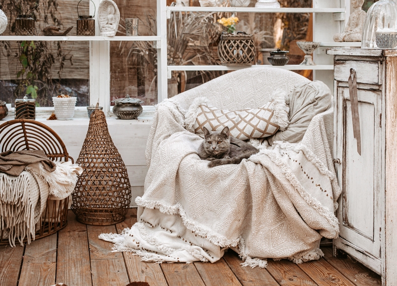
While it can be great for the environment to reuse or repurpose old pieces of furniture, purposely buying a scuffed-up and chipped-painted piece of furniture is a bit silly. Distressed wood furniture is also hard to match if you decide you no longer want to rock the shabby farmhouse look.
Gray Gray, Go Away
When it comes to home decor trends, every decade has its favorite color palette. From the avocado greens and harvest yellow of the ‘70s to the pastel overload of the ‘80s, there are some colors we just automatically associate with certain decades.
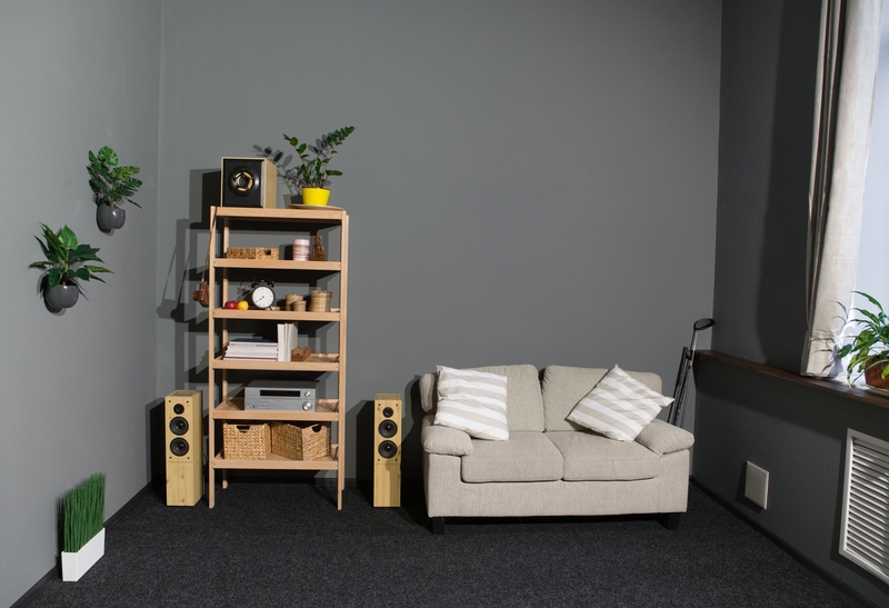
Years from now, we’ll probably look at the gray obsession of the 2010s with the same disdain. While gray can be relaxing and easy to match, it can look a bit depressing and drab. Between gray floors and walls, this gray overload makes us look forward to watching this rainy-day-colored trend go away.
Mirror Mirror on the Wall — Literally
In addition to letting us know if we have spinach in our teeth, mirrors can transform the look of a room by making it look bigger or more glamorous. Perhaps those benefits made us want to cover our entire walls with mirrors.
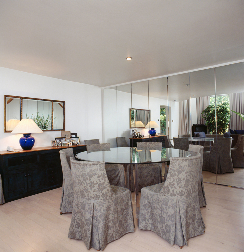
A common feature in many of the expensive homes of the ‘80s, mirrored walls may have seemed elegant, but they also had the side effect of making us feel like we were in one giant funhouse in the worst way possible. Just imagine how hard it was to clean these massive mirrors...
Etch-A-Sketch
Glass etching is a classic art form dating back centuries ago. During the ‘80s and most of the ‘90s, etched glass seemed to have a moment. From etched glass statues to etched glass doors, we couldn't get enough of this trend.

Most of the designs ranged from geometric shapes to scenes featuring wildlife like birds. While this trend is certainly not the worst of the decade (remember these are the decades that brought us the mullet), most of us are happy that this trend is no longer in style.
Shut the Barn Door
Fans of Chip and Joanna Gaines may want to skip this one, but many interior decorators will agree with us when we say “enough with the barn doors.” Yes, there are instances where a barn door will enhance the look of an older renovated home.
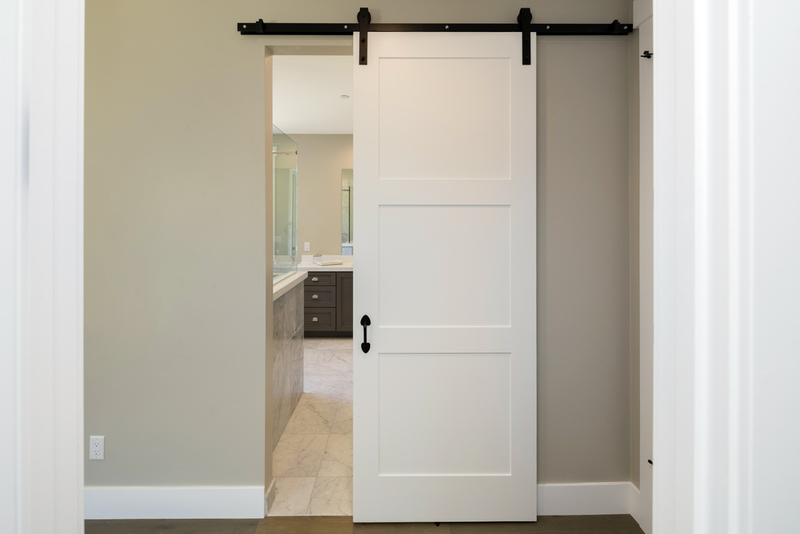
Today, however, we are seeing new homes with barn doors and it just looks out of place. Not to mention that barn doors don’t really provide privacy or soundproofing. If you're considering putting barn doors to replace the regular swinging doors of your bathroom, you might as well put nothing!
Just Say “No” to Laminate Countertops
Whether it was out of budgetary concerns or purposeful design choice, many of us have visited or lived in homes with laminate countertops. Laminate countertops are typically made with layers of plastic, paper, and chipboard.
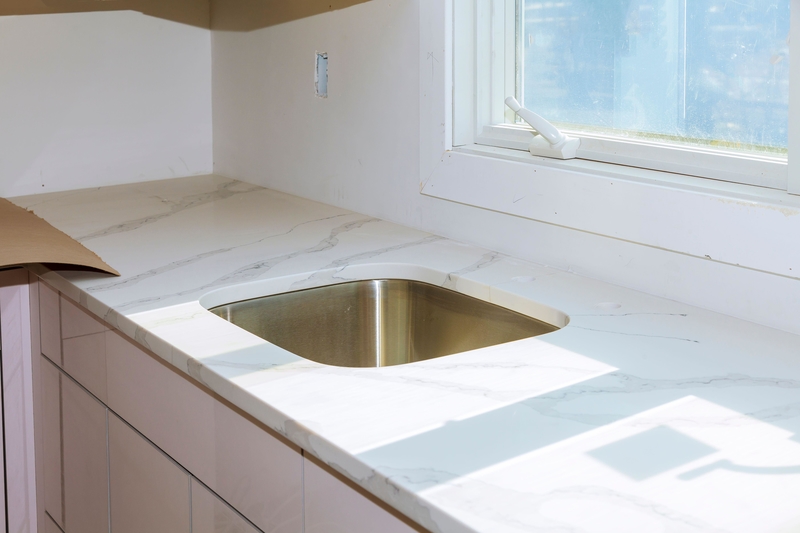
While there are some pretty nice looking modernized versions today, the laminate countertops of the ‘80s and ‘90s were pretty tragic. To make matters worse, they usually came in colors like pink, teal, or even (poorly done) faux granite or terrazzo finishes. Add to that the inevitable chipping and water damage, and these countertops quickly lost their luster.
Chatta-What?
If you grew up in the South, particularly Florida, chances are high that you owned or swam in a pool surrounded by Chattahoochee stones. These tiny and colorful stones were often used to create pool decks, facades of homes, driveways, and other areas.
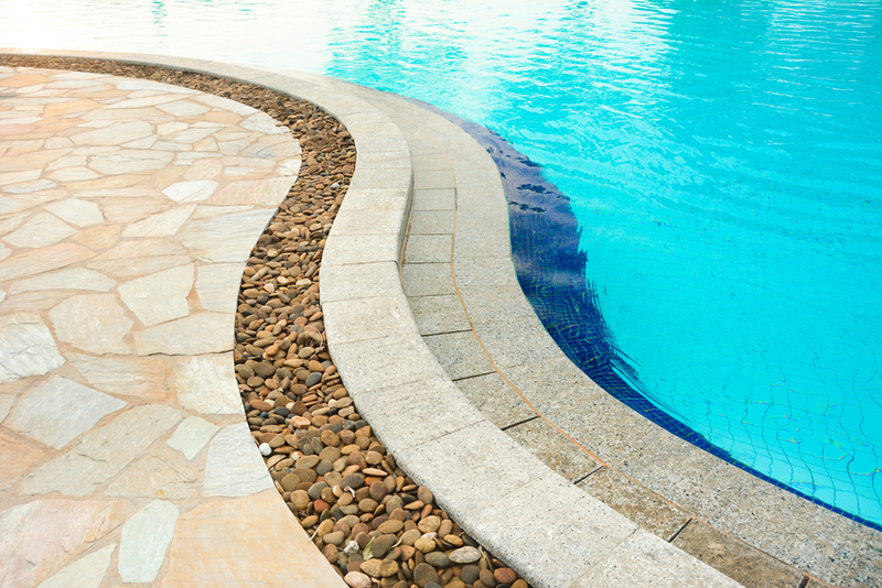
If you had these, you knew the distinct and very painful feeling of stepping on them with bare feet or heaven forbid stepping on a loose and sharp tiny rock. While some people still choose these rocks to create outdoor areas, they’ve generally fallen out of fashion (and we're sure barefoot bathers are quite happy!)
Oversized Ornate Furniture
Between the grand Tuscan-themed kitchens to the overly-large wrought iron light fixtures hanging from our vaulted ceilings, homeowners in the early 2000s wanted to feel like royalty in their homes (no matter how small their dwellings were).
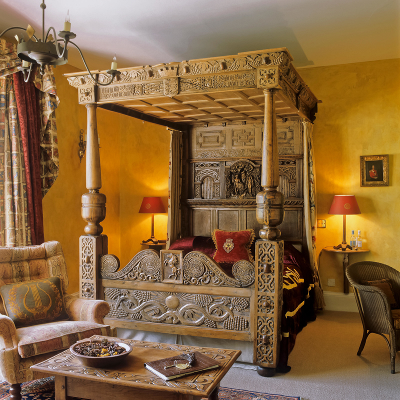
Part of that ostentatious trend was to buy large and bulky furniture fit for a medieval castle. Ornately carved dark wood furniture including chairs and four-poster beds seemed to be all the rage. Thankfully, we’ve now realized that it's probably not the best idea to purchase a bed that takes up your whole bedroom!
We’ll All Float on
The disconnect between “wow that looks great on Pinterest” and working in the real world has caused even the most experienced interior designers to commit some real home design sins. One trend that has come and (thankfully) gone has been floating steps.
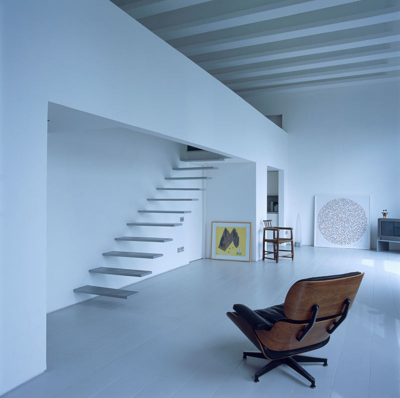
These staircases with steps that seem to float in the air and missing rails are just an accident waiting to happen. In fact, these stairs are so dangerous that some areas don’t consider them to be up to building code. To be honest, we get nervous just looking at them!
Go Big or Go Home
Given the sheer size of televisions and sound systems from a few decades ago, it's no surprise that furniture designers had a “bigger is better” philosophy when it came to designing wall units. These bulky wall units often spanned from wall to wall and almost to the top of the ceiling.
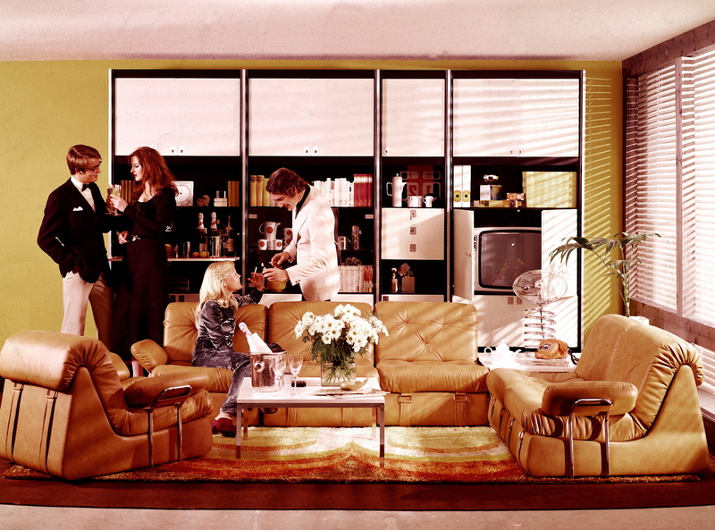
From holding the latest CDs (remember those?) to grandma’s knick-knacks, these behemoths of living room furniture were found in almost every home. Thankfully, as technology has advanced and electronics have become sleeker and smaller, the need for these massive wall units has waned.
No Celebration With This Confetti-Inspired Print
Admit it — just seeing this confetti-inspired print screams “early ‘90s!”. The design, which graced everything from walls to clothing, typically featured a solid colored background covered in erratically scribbled swirls, rectangles, or other geometric shapes.
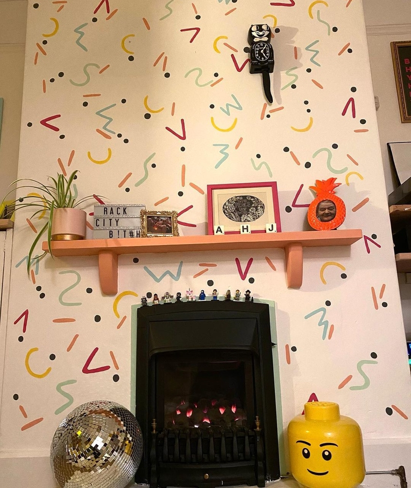
The end result looked like multi-colored ice-cream sprinkles but often left us with a sour taste in our mouths. Today the geometric and zig-zag print reminds us of the carpet in our favorite movie theater or the sheets on our childhood bed. Not the most stylish examples of decor!
Colored Leather
While leather furniture typically comes in black or more natural-inspired hues, there was a time when brightly colored leather seemed to be popular. From dark forest green to rich purple, leather came in a rainbow of shades, each one worse than the other.
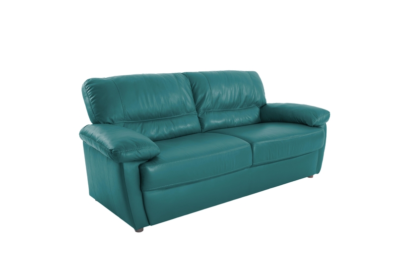
Not only was repairing a leather sofa in these tacky shades almost impossible but picking such a bold color made it difficult to change up the look of a room. These days, most people opt for an accent chair if they want to jazz things up.
What the Shell?
Seashells can be great… if you're collecting them on the beach. Perhaps interior designers were trying to get in touch with their inner mermaids, but there was a time when many bathrooms featured a shell-shaped sink carved into the bathroom vanities.

Not only were these sinks a pain to clean (hello nooks and crannies), but they quickly fell out of fashion leaving owners with a sink that instantly dated their home. When it comes to picking out a sink style, let's leave the seashells to the ocean and embrace simpler geometric shapes!
Sleigh It Ain't So
As with most things, furniture design isn't immune to misguided trends. Decades ago, sleigh beds (beds with outwardly curving headboards and footboards) became top-sellers in most furniture shops and people couldn’t get enough of the bulky designs.
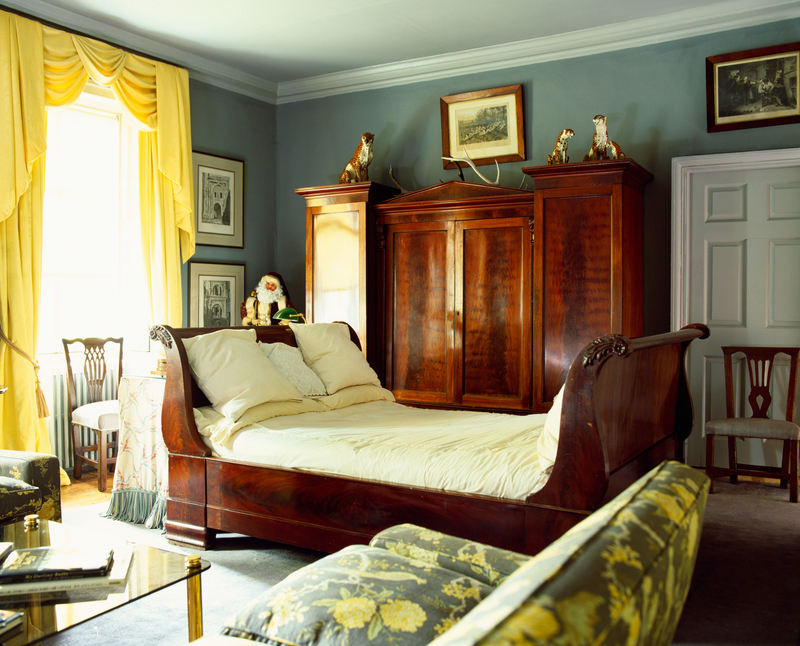
But as contemporary furniture design trends turned to more sleek or simpler designs, these oversized beds look comically out of place in most homes. Let's be honest, the only one who should be spending that much time in a sleigh is Santa!
Chalk It Up to Bad Taste
Chalkboards can be great for the classroom or even as a creative activity for a children’s room, but including them in your living room or kitchen is woefully dated. With our smartphones on us at every waking (or even sleeping) moment, we can't think of what could be so important that we need to write it down on a massive chalkboard.
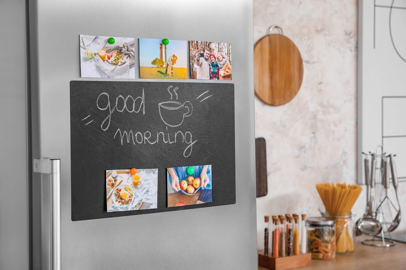
Not only is this Pinterest favorite a dated trend, but it also required constant dusting from all of the chalk and undesired fingerprints everywhere. Our tip — it’s better to invest in Post-its!
Not So Fan-Tastic
Before we rip into this trend, we will say that there is a very real need for fans in certain climates. That said, fans shouldn’t be the centerpiece of the room the way they once were. Decades ago, fans were considered interior decor eye sores with their large and included bulky metallic fixtures and long dangling cords.

This garnered them the wrath of most decorators. Today, people are keeping their fans but upgrading them to sleek and cord-free newer models that sit more flush to the ceiling, keeping their cool and keeping their home up-to-date.
Medieval-Castle Chic
Keeping in line with the “I want to live in a castle” home decor trends of the early 2000s, many homeowners lined their walls with bulky wrought-iron sconces and candle holders.
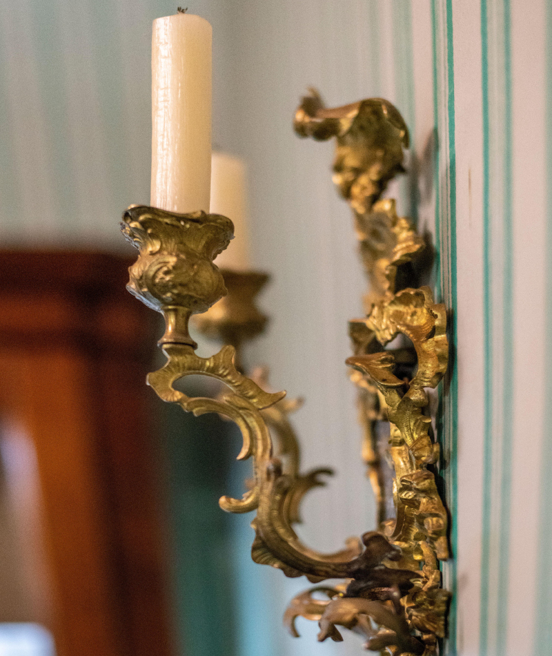
Considering that we now use electricity for most of our lighting needs, these antique-inspired wall fixtures seemed to be a bit strange. Also, what would you do if you actually did light one of these using a candle, wouldn't the wax drip onto the floor? It's no wonder these typically sat unoccupied until years later when you probably took the now rust-covered fixtures off the wall.
Awful Oil
Looking back, you probably can remember walking into a kitchen and seeing a collection of various uniquely-shaped glass bottles of herb-infused oil on a shelf. While infused oil can be a great way to add flavor to your food, these oils were solely for decorative purposes.
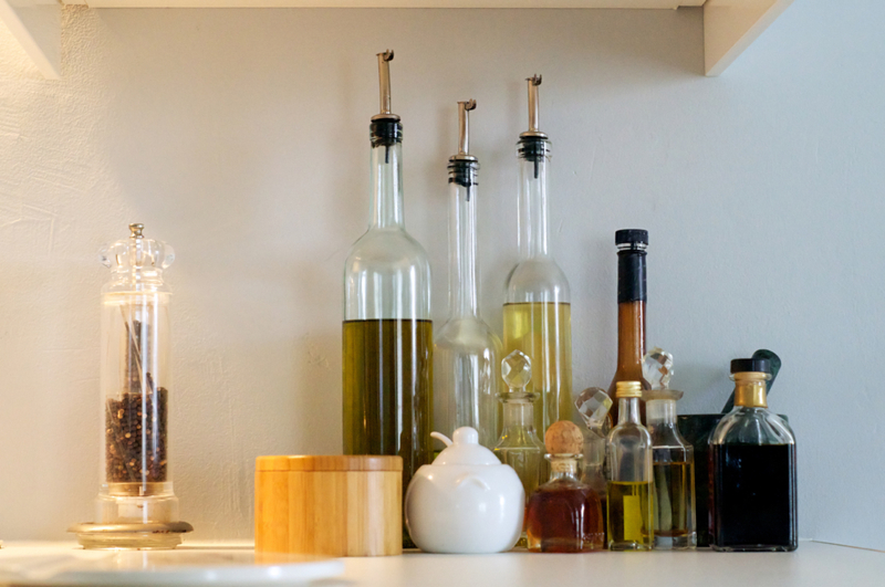
In fact, we’re convinced that they probably weren’t safe to consume from the get-go, let alone decades after sitting on your shelf. These bottles typically became dusty from years of sitting unused, or worse, discolored if they were placed on a windowsill in direct sunlight.
The Off-Limits Room
If you thought that you should have access to every room in your own home, think again. If you're of a certain age, then there's a good chance that your parents probably didn't allow you to play in the “fancy” living room.

Used solely for entertaining guests, this room typically featured an ornately decorated sofa (most likely covered in plastic protective gear) and a glass display cabinet full of equally unnecessary decorations. Today, thankfully, most homeowners try to make use of every inch of their homes and these rooms are a thing of the past.
Quirky Side Tables
Blame it on catalogs like SkyMall or the novelty shops of the ‘90s, but there was a time when many homeowners thought to add some character to their living rooms by adding a unique side table.

These side tables usually came in the form of a frog, dog, or some other animal dressed as a butler holding a tray. The trend was so common that even an episode of “Modern Family” featured a prized dog butler. Thankfully, in recent years we’ve let animals go back to being animals and side tables are now sleek and discreet.
Candy-Colored Bathtubs
Bathing can be a relaxing way to unwind after a long day. But anyone with good taste may find it hard to find tranquility while soaking in the garishly colored bathtub of yesteryear. Like the avocado refrigerators of decades before, bathrooms were also the victim of some very tragic colors.

Many homeowners painted their bathtubs in blues or pinks or some sort of faux marble finish. The result? A tacky and dated bathroom that never quite looked clean no matter how much bleach or elbow grease you applied. Thankfully, most homeowners are sticking to white bathtubs.
Send Shiplap Off to Sea
Shiplap has been historically used on the exterior of buildings and other structures, especially in harsh climates. These interlocking wood planks were made popular on a variety of HGTV shows, particularly on Chip and Joanna Gaines’ show “Fixer Upper”.
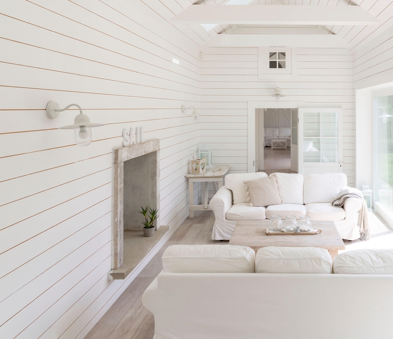
While this material can look charming in some homes, adding it just to be trendy seems a bit short-sighted. The look can make it hard to transition to other design schemes and can be annoying to clean as the gaps seem to attract dust. Interior decorators now suggest leaving the shiplap to actual outdoor structures.
Stone-Age Style
When the cold wind is howling outside or the snow is falling, there’s nothing like cuddling up to a warm fireplace. While fireplaces can be a warm and inviting addition to your home, the ‘70s brought a new trend — covering your fireplace with large stones, even up to the ceiling.
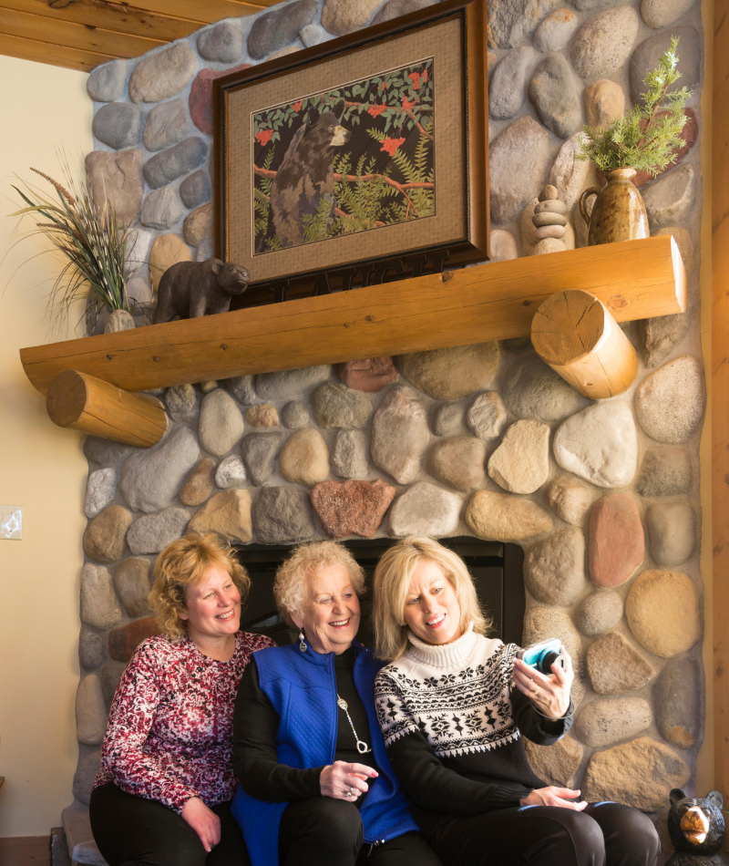
This dated design scheme seemed to overtake the warmth of the fireplace and just looks heavy and dark for most modern interiors. While there's nothing wrong with making your fireplace the focal point of the room, let's leave the heavy stones for the stone age.
Bold Bright Paint
While no one is suggesting that we all have to live in a plain white and sterile home, bright colors on the wall are a great way to date your home. During the ‘80s and ‘90s, homeowners saturated the walls and even doors of their homes in rich vivid hues.

Remember Monica's bright purple walled apartment in the hit television show “Friends?" Not only were her walls purple, but her kitchen cabinetry was painted teal. Let her iconically ‘90s apartment be a warning lesson for all homeowners on which colors NOT to choose!
Yarn Art That Makes You Want to Yawn
Though art made with yarn and other textiles had existed long before, the 1960s and 1970s saw the rise of framed yarn art. From fall-colored country landscapes to funky geometric tapestries, yarn was everywhere.
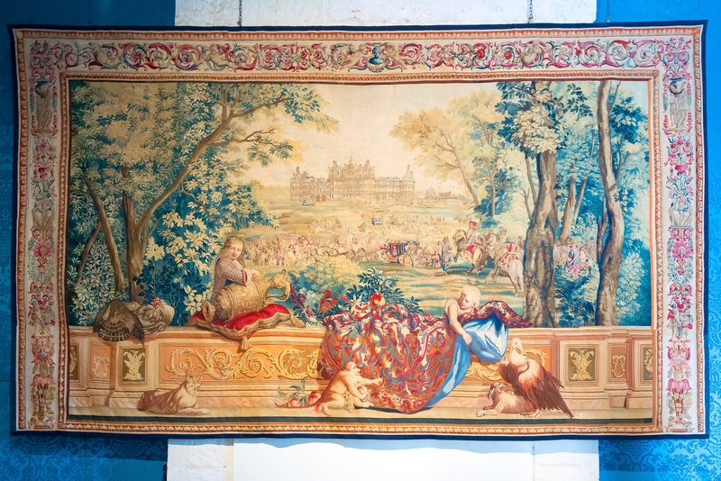
While the craftsmanship required to create these pieces is certainly notable, the execution wasn’t always the best. Not only do these pieces now look extremely dated, but the warm colors typically used tend to clash with most contemporary homes. Today, homeowners are choosing accent pillows or other pieces to add color and texture to their homes.
Posters of Famous Artworks
We get it, there’s a reason why people travel thousands of miles to art museums to see famous works of art. But while Vincent van Gogh’s “The Starry Night” looks amazing hanging in a museum, it doesn’t look that great hanging above your chipped Formica dining room table.
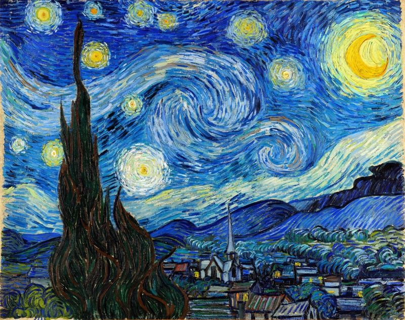
Posters can be a good and inexpensive way to bring some of the most renowned pieces of artwork into your home, but these overly-replicated pieces can also look tacky. Do yourself a favor and check out thrift stores or local artists if you want art on a budget.
Not-So-Sweet Honey Oak Cabinets
If you owned a home in the ‘90s, it's likely that you chose a specific shade of wood when it came to building your kitchen — honey oak. This wood was seen in almost every home during the decade, and can still be seen in the backdrop of many television shows filmed during that time.
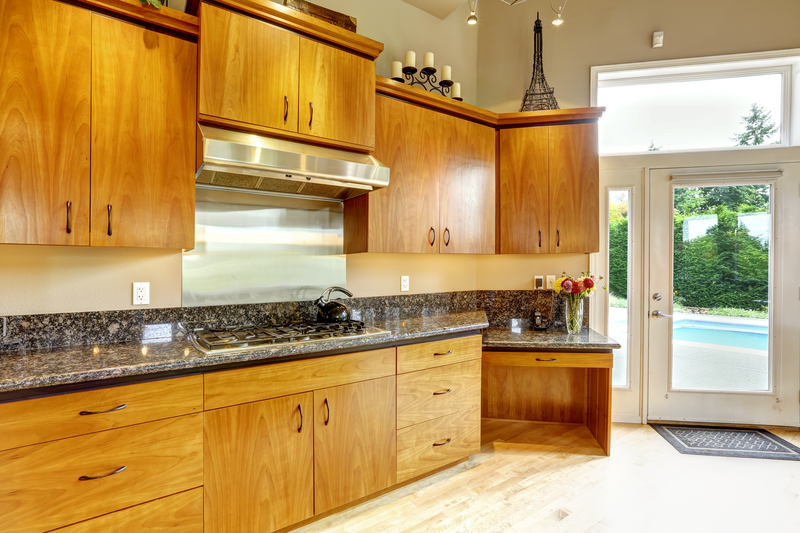
These cabinets were typically combined with dark quartz countertops (perfect for placing your can of Surge on!), and just look dated at this point. Nowadays, many homeowners are painting over their honey oak cabinets to bring their kitchens into the new millennium.
Boring All White Appliances
While they're certainly better than the avocado-colored appliances of yesteryear, all white appliances can look quite old-fashioned. While budgetary concerns can obviously mean sticking to what you’ve already got, homeowners in the market for new appliances should steer clear of white appliances.
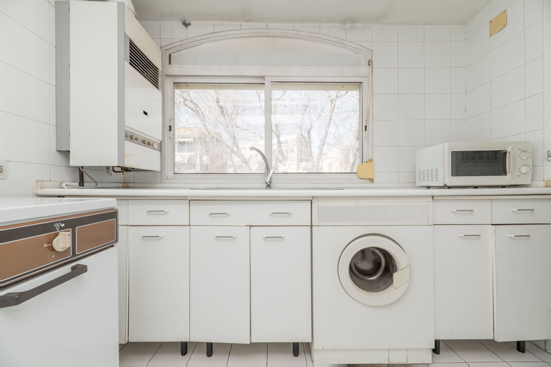
Not only do they look dated, but they show every smudge, drip, and spill (seriously, how do you keep them looking clean?). Interior decorators typically suggest stainless steel appliances or even integrated appliances (that look like their part of the cabinetry) for a more modern look.
Garish Graphic Patterned Floor Tiles
Like the tribal tattoos of the ‘90s, some trendy choices are a bit harder to get rid of than others, at least that's what most interior decorators think about bold graphic patterned floor tiles like busy Moroccan-inspired tiles or dizzying geometric chevron patterns.
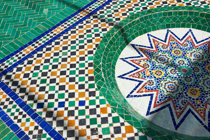
The problem with using these tiles is that you may get tired of them quickly, or you may want to try a different design scheme down the line, and retiling a bathroom can be pricey. A better way to add some color or fun is to buy an interestingly patterned bath mat.
Go Back in Time With Crocheted Blankets
If you didn’t have a crocheted blanket on the back of your sofa, then you probably used to see one at your friends’ homes. Often made by our grandmothers or given as gifts, these blankets were itchy, scratchy, and not as warm as they looked.
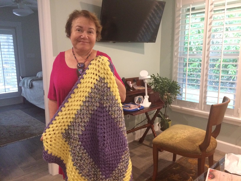
To be honest, we still don’t really understand the point of them. While crochet seems to come and go as a trend, these blankets will always remind us of our grandmother’s house — not exactly the trendiest place!
Macramé Everything
While we can appreciate a good arts and crafts session, the resurgence of macramé has gotten a bit out of hand. Once extremely popular in the ‘70s, macramé woven art has found a second life with the popularity of the boho aesthetic.
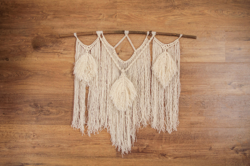
From hanging plant holders to wall tapestries, it's all a bit too much. Not only can the threads used to weave these pieces fade or tear, but they also attract dust, giving them a dingy look. If you still can't part from your ball of cord, limit yourself to one macramé piece per room.
Living on the Fringes
While fringe accents have been around for a long time in fashion, there was a time when we decided to add fringes to just about everything we could find. From tablecloths to lampshades, everything seemed to have some sort of fringe element.
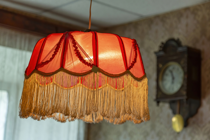
While the fringed trim seemed to be a good idea, one thread would often get damaged, making the rest of the trim look awful. We still don’t know why having a lamp that looked like a flapper from the 1920s was a good idea.
Too Much Granite
As a general design and life rule, remember that too much of a good thing is always bad. That’s certainly the case with granite. While granite countertops are still a popular design decision, there are other materials available to bring some contemporary flair to your kitchen.
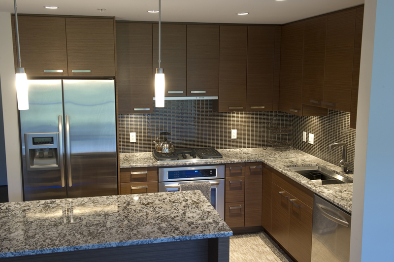
Granite isn’t a bad choice, but something like marble or even concrete can lead to a more modern-looking design. Granite isn’t entirely out, but a minimalist aesthetic of lighter materials is definitely in.
Don't Forget About the Doilies
When it comes to your basic home design, you should just stay away from lace altogether. While lace tablecloths are a no, lace doilies are an even worse design faux pas.
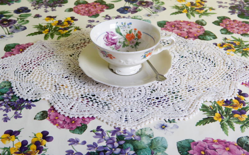
Do people even use doilies anymore? What is their purpose? These little design accents aren’t useful. In fact, they’ll probably age both you and your home significantly. And who wants that?
The Mason Jar Craze
Mason jars were cool for about a year. They certainly have that homey, DIY effect that makes your space feels like yours. In addition, they’re just charming enough to look like an actual design decision, rather than lazy decorating.

Unfortunately, the mason jar trend is lazy. Placing empty jars around your house doesn’t make you an expert in interior design. This trend is so worn out that we can hardly keep ourselves from rolling our eyes every time we see it.
Fake Flowers Are a Bad Idea
Craft stores are filled with full aisles of vibrant silk plants. But just because the plants exist doesn’t mean you should take them home. The ‘90s supported the trend of fake flowers scattered across your house, but the real thing is so much better!
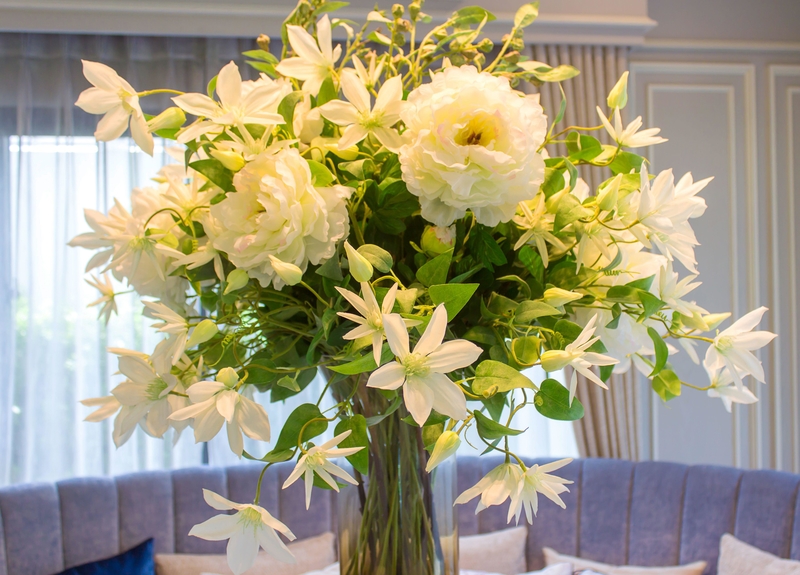
Instead of buying giant silk plants, opt for real plants that are easy to take care of. A couple of temporary bouquets around your home are the perfect way to bring the outside inside.
No More Dusty Colors
Anything described as “dusty” shouldn’t be part of your home decor design. Unfortunately, in the ‘80s dusty pastels were all the rage. These somewhat-muted colors usually came in blues, pinks, and greens, covering furniture and walls in their soft-hued glow.
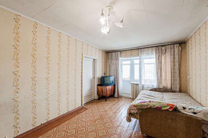
However, dusty pastels always look a little dirty, no matter what you might do to clean them. They also fail to create a clear color palette. Instead, your room is a smattering of pastel hues that feels chaotic, rather than calming. Choose a color scheme free of dusty pastels and leave that design decision in the past where it belongs.
Floral For No One
Floral used to be the thing to have in your home, particularly in the ‘80s. Want to buy a couch? Make it floral. Looking for curtains? Floral. Even pillows, pictures, and vases all had to be floral.

Unfortunately, floral now makes for a very outdated design. It’s a signature of a different decade that just doesn’t fit into the modern aesthetic. Using floral elements as accent pieces is perfectly okay, but implementing a floral theme throughout your entire home will turn your pad into a bad ‘80s movie.
Just Too Much Wood
Have you ever entered an older, ‘70s-style home and walked right into a den full of wood paneling? It was at one time the ultimate decorating decision that easily replaced plaster and drywall. Today, however, wood paneling just makes a space look dreary and dated.
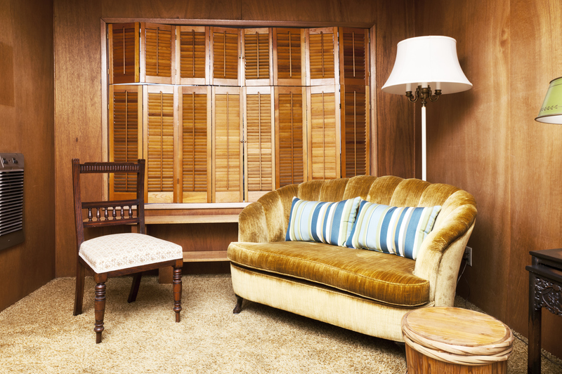
In addition, wood paneling requires quite a bit of maintenance. Some wood needs to be oiled so it doesn’t lose its natural moisture. If it gets too wet, however, it can rot and warp, causing serious problems in your home. Beyond all that, the paneling just doesn’t look right in a contemporary house.
Tan Kitchen Cabinets, Don't
Are you sensing a theme here? Bright colors are perfect accents, but they shouldn’t dominate your entire space. That’s why colored cabinets are such an egregious design mistake.
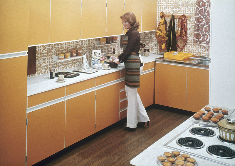
Burnt orange or puke green dominating your kitchen isn’t a trend we want to see again. Beyond being outdated, the bright colors simply don’t look good. Opt for neutral colors for your cabinets, and add a little flair to your backslash and appliances. That’s the right way to do things.
Decline the Pine
Pine is a light wood that—we’re sorry to say it—isn’t all that interesting. While pine can look good as a subtle accent, sets of furniture made entirely of pine are painfully bland.

Unfortunately, the ‘80s and ‘90s really leaned into the utility of pine furniture. Bookshelves, dressers, desks, and cabinets were all made of the most boring wood you could find. Pine just doesn’t add anything interesting to your house. It’s time to switch to more interesting materials.
No to Lino Floors
Linoleum flooring was once used commonly in kitchen and dining areas because of its resilient nature. The flooring is incredibly durable, has a slight cushioning effect, and is very easy to clean. Unfortunately, it’s also ugly.
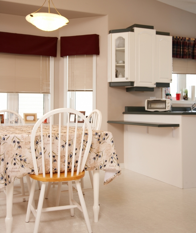
The old-style linoleum flooring can change color in the sunlight, turning your kitchen or dining space from a shining white to a dirty yellow. Linoleum flooring just feels gross and outdated. It doesn’t have the flair that modern materials bring to a space, which is why it should be retired forever.
Why Plaid?
How did the ‘70s go so terribly wrong with their design decisions? The inclusion of plaid in your home decor also originated in that era. We’re starting to get the feeling that interior designers were just trying to ruin people’s lives.

Plaid is a tough look to pull off in any situation, let alone plastered over your walls and bedspreads. If we never had to see this trend again, it would be too soon.
Sorry, Sailor
How did the nautical theme in home decor even get so popular? Anchors everywhere and that signature blue and white theme—aren’t we bored of it yet? Well if you’re not, we certainly are.
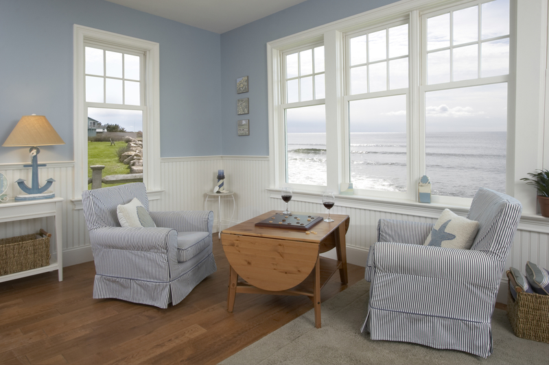
This cheesy decor tries too hard to make you feel like you’re at the ocean, rather than creating a design that actually feels like you. Your home doesn’t have to look like it came straight out of a magazine to look good. If you want a beachy theme, settle on a more subtle color palette and decor, rather than the overt nautical ornamentations.
Lace Galore
While floral was imposing enough, it was often paired with another outdated design material: lace. More specifically, lace tablecloths used to be a huge trend. Unfortunately, too much lace in any one space turns your room into a granny paradise.

We know your grandma can’t get enough lace, but it looks undeniably outdated when used in modern home design. Plus, it’s not even that functional! How could it really protect your table with all those open spaces?
Use Paint Instead
Wallpaper is a good way to add a little interest to your space. Unfortunately, there was a time when some people took that to mean that any kind of wallpaper was acceptable. We’re here to tell you, that’s not the case.
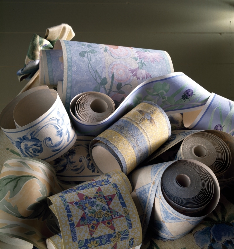
Wallpaper borders have got to go. Whether in the middle of a room or a trim at the top of your wall, bits of paper plastered around your space always look cheap. Either go for full wallpaper or be comfortable with nothing at all.
Who Thought of Popcorn Ceiling?
Most people can agree that popcorn ceilings were a terrible design choice. Not only are popcorn ceilings known to contain asbestos fibers, but they’re also just plain ugly. Popcorn ceilings were used throughout the ‘70s and beyond because they were good at absorbing sound, offering you a little more privacy in certain rooms of your house.
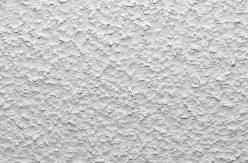
However, a little sound reduction isn’t worth the outdated look of these messy ceilings. If you want popcorn, go to the movies, but please keep this textured look off the roof of your house.
Your Bed Doesn't Need a Stage
Considering platform beds take up so much space, it really is a miracle that they were ever popular. However, the ‘70s design loved taking advantage of this trend.

By putting your bed on a platform, you basically ensure that it’s the only focal point of your room. Depending on how much space you have, it might be the only thing you can fit in your room. It’s quite unnecessary, and we desperately hope this trend doesn’t find its way back into the mainstream.
Are Vertical Blinds Still a Thing?
Did anyone ever like vertical blinds? While they certainly work, they always manage to look turn your home into an office. They ruin the aesthetic of your room by draping over your window, forcing you to open them all the way to see into the outside world, or close them entirely and shroud your home in darkness.
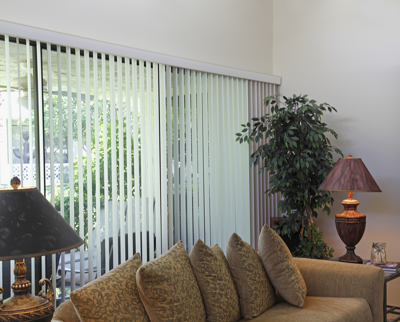
What’s more, the white vertical blinds always end up dirty, and they’re a huge pain to clean. Opt for a more contemporary blind option, or simply settle for curtains that beautifully frame your windows.
This Isn't Hollywood
The mirrors rimmed with brightly-colored bulbs are perfect for children and young adults who want to live out their dreams of being a star. But as you get older, you realize that all that harsh lighting just brings out your wrinkles and other blemishes.
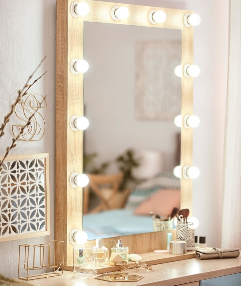
Trust us, you don’t want to be blinded by this light every morning. You’re not a Hollywood star and you don’t need Hollywood mirror lights in your home.
Mirrored Ceilings — Yikes
We can’t lie—ceiling mirrors creep us out. They look like something straight out of a horror film, so it should come as no surprise that we don’t want to see them in any modern homes.
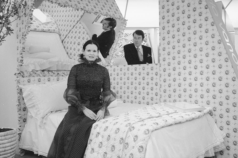
However, ceiling mirrors were once the height of chic design. Gloria Vanderbilt herself even embraced the look. Today, however, ceiling mirrors look cheesy and odd. Stick to the mirrors on the walls, rather than taking your looking glass to the roof.
Wrong Century
Edison bulbs are about as simple as you can get with your lighting—they’re just plain bulbs. While the inventors of this trend have tried to popularize the aesthetic by calling it “exposed,” the truth is it’s not very exciting.

While the look can work for a trendy coffee shop, it doesn’t translate well into a house. One bulb just looks lazy, and a whole group of bulbs will infuse your space with a little too much light. Plus, this lighting is incredibly harsh and unforgiving. Do you really want to deal with that every day in your own home?
Green Fridges
Brightly colored kitchen appliances aren’t a new invention. But nowadays, people will opt for a colorful mixer or kettle, leaving their main appliances to neutral designs like stainless steel or white.
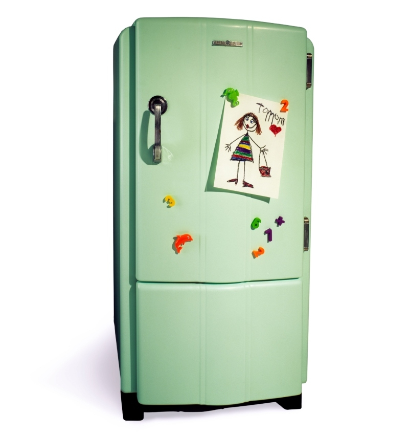
Sadly, the ‘70s weren’t just about green carpets. People also loved a green fridge. While the concept sounds fun in theory, it doesn’t look that good in application. That’s a lot of color in one corner of your kitchen, making it pretty difficult for you to balance the rest of your space and create a coherent aesthetic. We’ll stick with our silver-colored fridges, thank you.
That Fruit Is Not So Fresh
Much like fake plants, fake fruit has even less of a place in your home decor. Somehow ‘90s style made some of us think this was okay. While the fake fruit could be fun to play with, it doesn’t actually add anything to your space.

Instead of putting some fake fruit in a bowl, why not find a really incredible piece that fits with your design aesthetic? Not only will you elevate the look of your home, but you’ll also avoid guests accidentally trying to take a bite out of your decor.
You're Showing Off
Curio cabinets are those free-standing glass display cases that house your most precious treasures. If you’re a collector, you might be tempted to get a curio cabinet to show off. Unfortunately, curio cabinets look old and dusty in the modern era.

Design pieces and other trinkets should be bought so you can place them around your home, not so you can stuff them all into one tiny cabinet. Let your prized possessions mingle with the rest of your home or find a safe storage area where they won’t be touched, but don’t get a curio cabinet.
No to Tiled Bathrooms
While tile countertops could be found in nearly every home during the ‘70s, they’re just not that cute. We’re not sure who came up with this genius idea, but they should be fired.
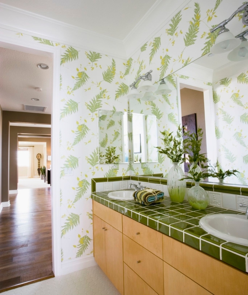
Beyond being exceptionally difficult to clean, tile countertops also aren’t very durable. They chip and stain easily, and are prone to stains and hidden bacteria. Those are all qualities that make tile countertops a terrible choice for any space that will get remotely dirty. Avoid the stress and the outdated look and go with a more modern material for your house.
A Frilly Skirt for Your Bed? No
The ruffled bed skirt trend finds its origin in the ‘80s, when nearly everything was ruffled. The skirt should add a little feminine appeal to a room, making it a perfect choice for young girls or women who don’t care about their husband’s opinions.
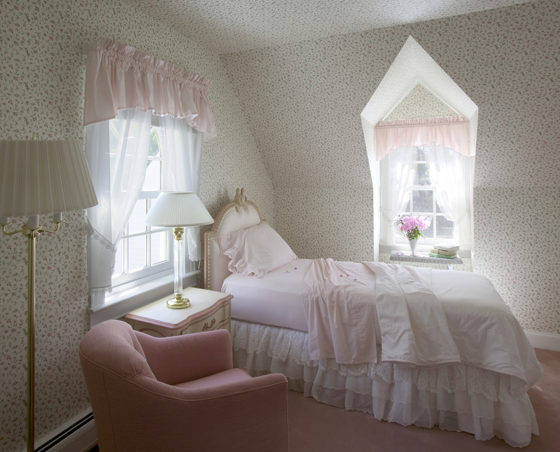
However, we believe that the ruffled bed skirt trend should never make its way back into the mainstream. Modern design is minimalist and chic. The ruffled bed skirt is too busy and froofy to look genuinely stylish.
Stop It With Those Damask Patterns
This interesting pattern could be found everywhere in the ‘90s. It combines a sort of floral and chintz to create texture all on its own that doesn’t really fit into either category. It’s not the worst-looking statement piece, but it was used so often during its popular time that we can’t stand to see it again.
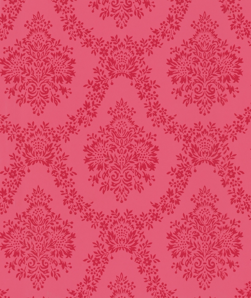
Plus, the damask pattern is now considered fairly old-fashioned. Large, statement blooms look a little more modern, but they still infuse your home with that delicate touch you’re looking for. Please graduate to a more modern look, instead of continuing to reuse damask.
The Futuristic Look
If you’re stuck in the present, you really shouldn’t try to live in the future. Unfortunately, interior design trends didn’t get the memo. Some interiors opt for chrome finishes and sculpted side tables to really bring out that futuristic look.
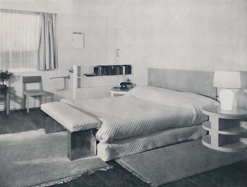
Unfortunately, it always ends up looking a little dumb. The pieces never combine well with each other and the overall aesthetic is sterile and cold, rather than futuristic. If you’re aiming for a futuristic look, try something industrial instead. You might find that it works a little better.
This Pink Isn't Cute Anymore
So far we’ve only been picking on trends from prior decades that need to go. However, millennial pink is a newer trend that needs to go in the trash. At first, the bubblegum-pink color brightened a space and added a bit of fun.
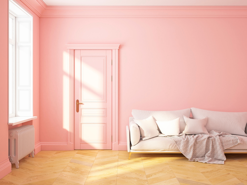
But now, it has gone too far. Pink isn’t a color that can stand the test of time. After a few weeks in your blush-colored pad, you’ll be sick of seeing pink everyone you go. New tones like yellow and muted greens have the potential to endure as a design decision. It’s time to make the switch.
Don't Sponge Your Walls
If you’re going DIY with your home design, it’s tempting to opt for something that’s easy, rather than something that actually looks good. We’re pretty sure that’s how the sponge walls trend got so popular.
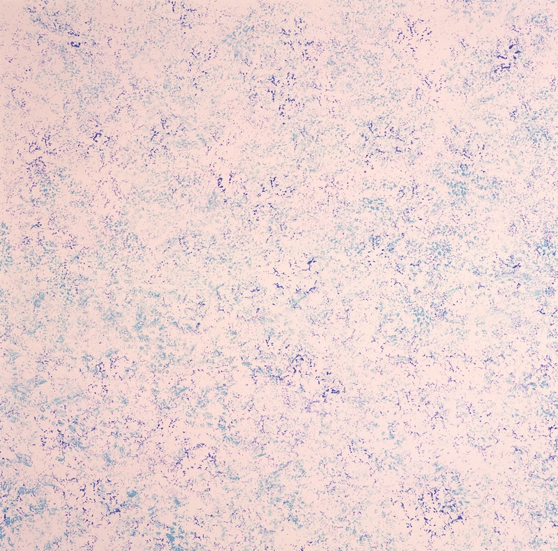
Instead of carefully painting the interior of their house, homeowners would dab paint on the walls using a sponge, creating an odd, textured look. While texture can add some serious style to your space, sponge painting always looks lazy. It’s time to retire this DIY trend.
Get Rid of the Shag
While shag carpets feel wonderful under your bare feet, they’re also somewhat of a disaster to actually maintain. They tend to be fairly expensive, and they’re prone to unraveling over time, thereby leaving loose pieces of carpet all over your house.

In addition, shag carpets tend to capture more dirt and debris and are more difficult to clean. Shag carpets aren’t even recommended to people with allergies for this very reason. Is the added comfort really worth the cost of both your health and a clean home?
Don't Put Your Name on It
Although monograms feel like they belong in a different time, they’re actually circling back around to become popular once again. Unfortunately, we don’t support them.
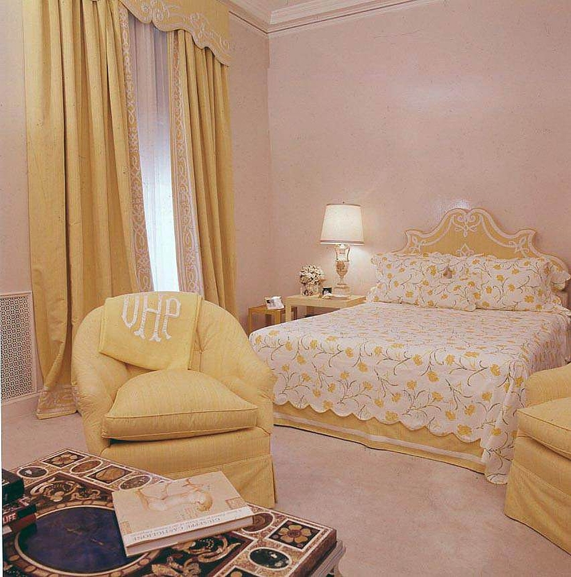
What’s the point of emblazoning your initials on something you own? The monograms often look cheesy and tacky, and they don’t really add anything to your space. Don’t hop back on the bandwagon. Stay away from monograms.
Weird Chintzy Fabrics
While damask designs don’t belong in a modern home, chintz is just as bad. Chintz uses a multicolored cotton fabric with a glazed finish to create some...uh...interesting pieces of furniture. Like most bad design trends, chintz fabric really rose in popularity during the ‘70s.

However, any type of multi-colored fabric doesn’t really work anymore. At least, not as the primary focal point of your room. If you want to toss a statement chair in the corner with a bit of chintz fabric, it might work. But as a general rule, it’s best to steer clear of this design.
Throw Out the Stained Glass Lamps
Tiffany lamps emerged at the beginning of the 20th century when Louis Comfort Tiffany began creating lampshades that used much of the same processes as stained glass windows. While Tiffany lamps do have a sort of antique appeal, it’s difficult to blend them into a modern space.
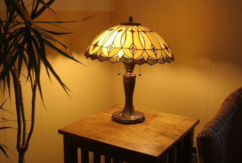
No matter how you try to spin it, Tiffany lamps make a room look dated and out-of-touch. If you can find a way to display the lamp that shows off the beautiful shade, we’re all for it. But if you’re planning to use it for actual lighting, we suggest that you just don’t.
Why Does This Exist?
Conversation pits sound like a bad social situation, but it was actually a ‘70s design feature that changed the architecture of your home. In the middle of a normal room, the floor would drop into a pit with built-in seating. When dinner parties would end, all the participants would head to the conversation pit to end the night.
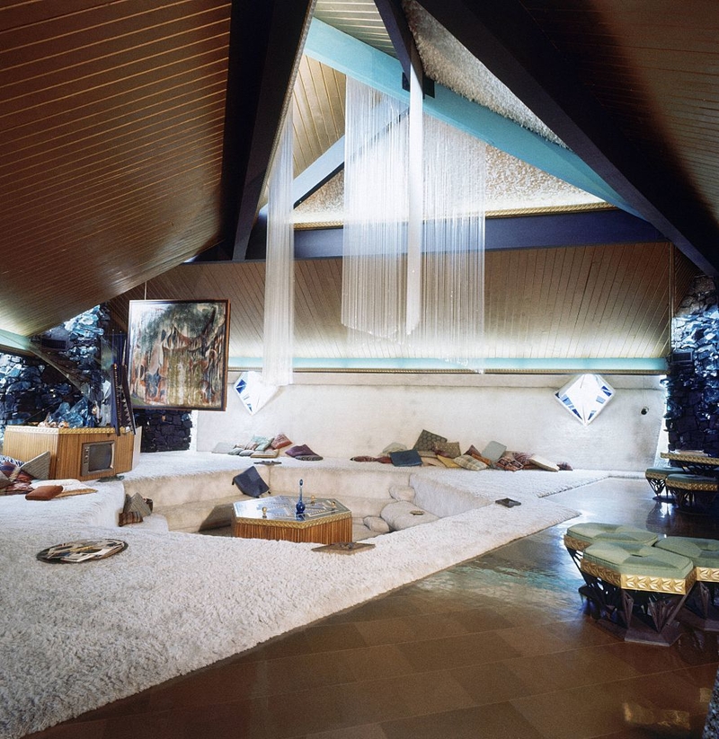
Thankfully, normal living rooms serve the same purpose as the conversation pit. Plus, they don’t require a cutting hole into your perfectly fine floor. We doubt conversation pits will be making a reappearance any time soon.
This Isn't Tuscany
If you thought you could capture the appeal of the Italian countryside in your home, you’d probably opt for this design trend as well. The Tuscan kitchen was big in the early 2000s, and it does have a sort of grand elegance. The dark cabinets and stone accents look luxurious, but they don’t quite keep up with modern design trends.

Now, the kitchen is supposed to be light, bright, and airy. After a while, the Tuscan kitchen can start to feel stuffy and dark. It’s not the worst design trend we’ve ever seen, but it should be retired nonetheless.
Massive Leather Sofas Are an Eyesore
Leather sofas, when done correctly, can look beautiful and homey. Unfortunately, the ‘70s brought us a trend of oversized leather furniture that dominates an entire space and can easily turn any family home into a man cave. The trend reappeared in the early 2000s, but it looks like it’s officially died out once again. We’re hoping it doesn’t come back.

Leather will never go out of style, but the imposing nature of a huge leather couch t really ruins a room. Leave room for other things to exist in your room beyond your sofa.
Animal Rugs Are Out
You really should keep the zebra rugs, or any animal rug, for that matter, far away from your home. Beyond the fact that animal lovers will have your head, the striped rugs don’t fit comfortably in any space.
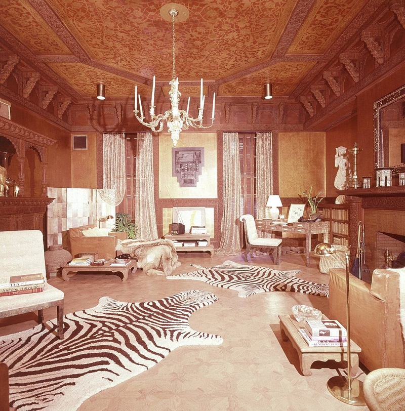
Zebra rugs were supposed to infuse a space with a kind of exotic flair during the ‘70s, but the design feels cruel and unnecessary. Plastering a zebra rug across your floor feels a little silly in the current climate. Plus, it leads to a rather cheesy-looking home design.
They're Not Twins
There is definitely such a thing as too much matching. It’s great to tie your space together, but including window valances that match the curtains, and curtains that then match the furniture turns your space into a single-patterned nightmare.
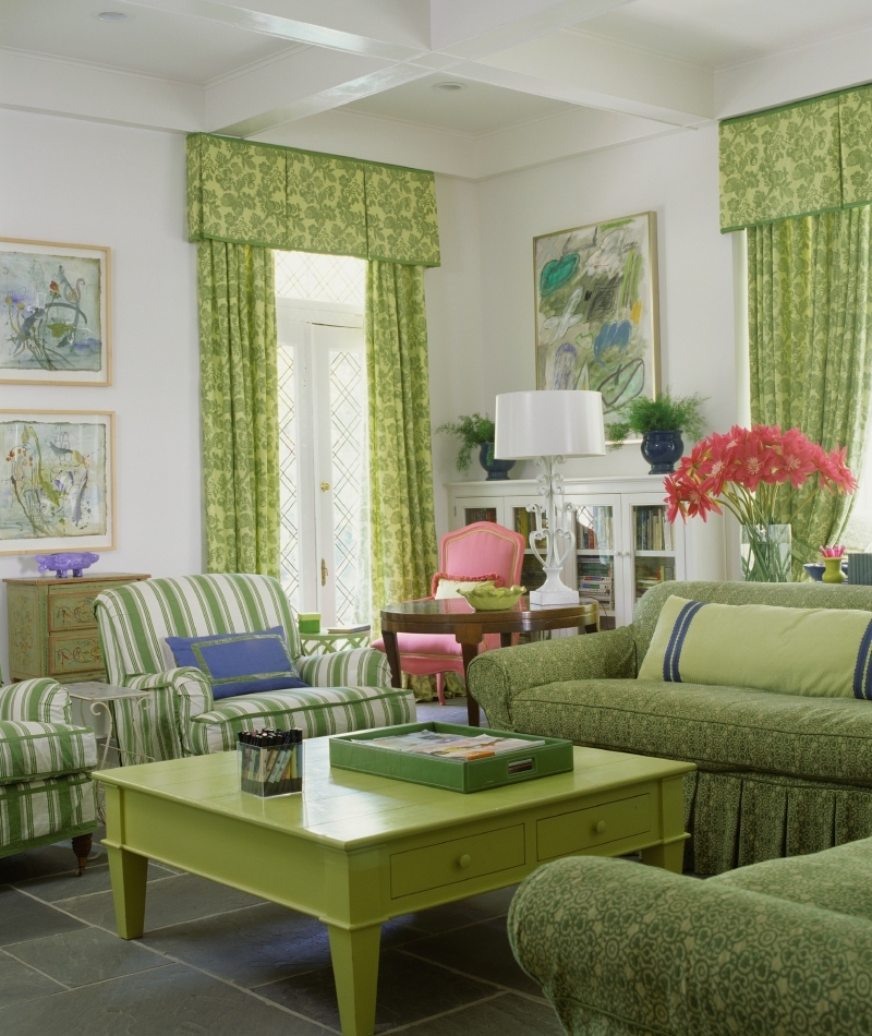
This home decor decision is a staple of decades past. It might look good in your grandma’s house, but it’s not the look you should want in your own home. Go with something modern and updated, not a single, limited color scheme.